


Team:
Zheqin, Divya, Jiaqi, Precious, Zhuyu
Role:
Researcher, Designer, Prototyper
Duration:
Apr 2022 - Jul 2022
Refined in Mar 2023
Tools:
Miro, Figma, C4D, KeyShot
As Web 3.0 approaches, many new digital spaces such as the Metaverse come into view among the public. How can traditional financial service providers utilise these new opportunities to adapt, explore and thrive in novel ways of meeting user’s needs? Through our collaboration with
, we unveil an intriguing idea in this project.
Everything before the final delivery was completed together by all team members. For the final outcome, I was allocated to the visual part, including the storyboards, 3D elements building and collaborative interface design.

01
Overview
02
Discovery
03
Definition
04
Development
05
Delivery
Overview.
Introduction.
Capco is a global technology and business consultancy focused on the financial services sector. They help shape the relationship between people and Financial Services.
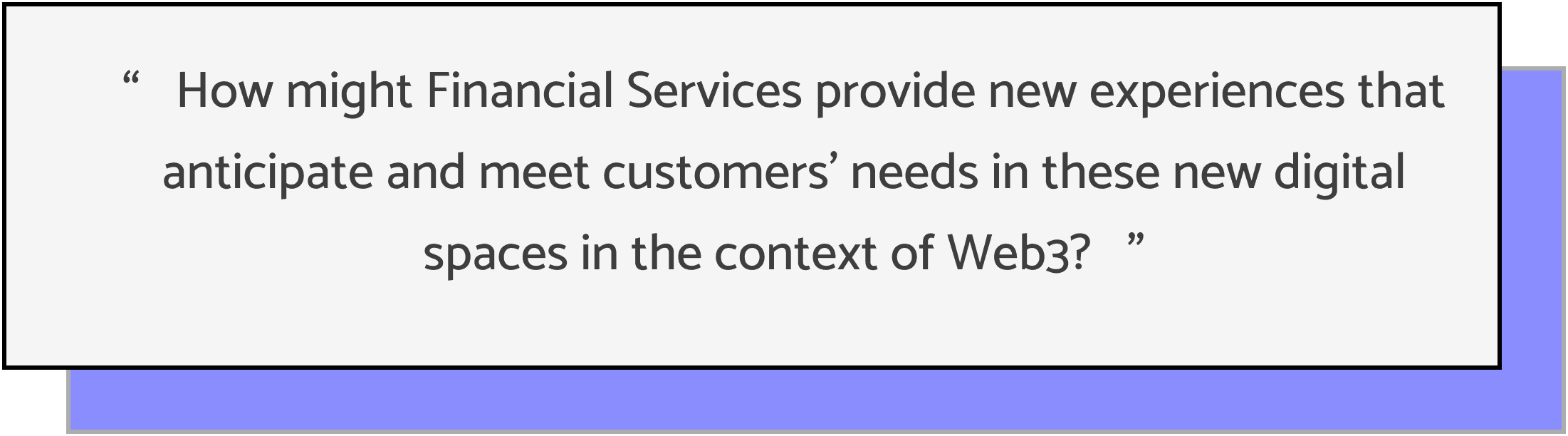
As Web3 keeps trendy in the tech industry, it has become top-of-mind for many other businesses in recent years. Banks are no strangers to jumping on the bandwagon, and the latest hot topic in Financial Services is the Metaverse. However, without a clear use case based on people’s needs, or a problem to solve, exciting ideas can flop. Therefore, Capco brought up a good question:
“ How might Financial Services provide new experiences that anticipate and meet customers’ needs in these new digital spaces in the context of Web3? ”
Challenges.
We all have heard about Web3, blockchain, decentralised finance, cryptocurrency and metaverse. But none of the team members knew their exact definitions or the connections between them, much less familiarising the pioneer financial services that already exist in these new digital places. Therefore, we did some research to clear the literacy barriers. Despite the gradually clear understanding of the concepts, we still found the projects very challenging in these aspects:
Highly Specialised Fields
Our knowledge base enabled us to only scratch the surface of the fields of financial service and Web3.
#1
Opportunity-driven
The project started with an opportunity instead of a problem. We needed to explore customers’ needs in the broad context of Web3. Meanwhile, financial services cover a broad range of products. Thus, it was hard for us to quickly narrow down a user research direction.
#2
Few Reference
Existing products in this field were seriously homogenized, such as NFT trading platforms and crypto wallets.
#3
Limited Time
Only 8 weeks were given to complete a fresh future financial product from zero to a tangible prototype.
#4
Yet, navigating uncharted waters also means great possibilities.
Framework.
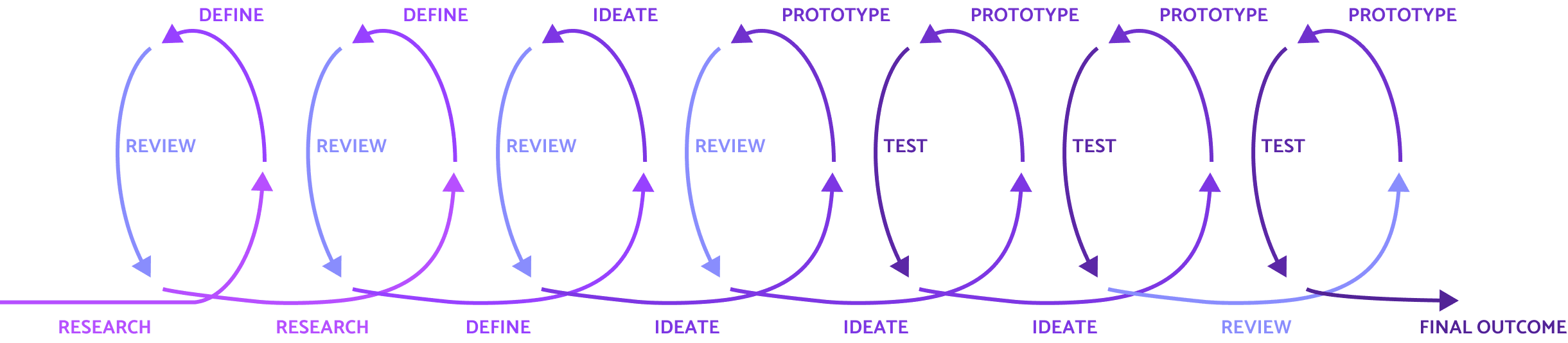
This was a project that closely cooperated with our client Capco with a financial consultancy background. Since this was a journey into the unknown, we cared very much about the voice of the client throughout the whole dynamic development process. Therefore, we applied Agile to our design process while following Double Diamond as the main thread. Agile UX helped in creating an iterative approach to design. We could work on a more flexible scale by enabling iterations in every phase. In this way, we could positively respond to the changes based on clients’ and users’ feedback.
Discovery.
Assumptions.
Without possible research direction, we started our discovery by brainstorming the potential user groups and financial challenges. Then we used 5W1H to unpack our assumptions. After discussion, we decided to focus on young professionals aged between Millennials and Gen Z to carry out initial secondary research to get more background information. We chose these groups because they faced overlapped financial challenges, tended to embrace Web3 and they were highly accessible to collect data throughout the project.
Secondary Research.
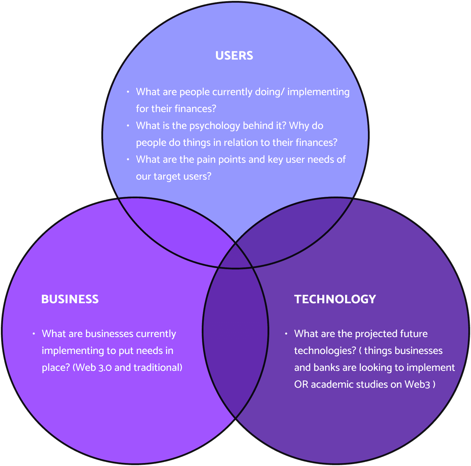
To look into which area within our chosen target group we want to focus on, we conducted secondary research. We devised five questions from the perspective of users, business and technology (the core factors considered in UX design) to navigate our research. The following questions were split amongst the team members to research.
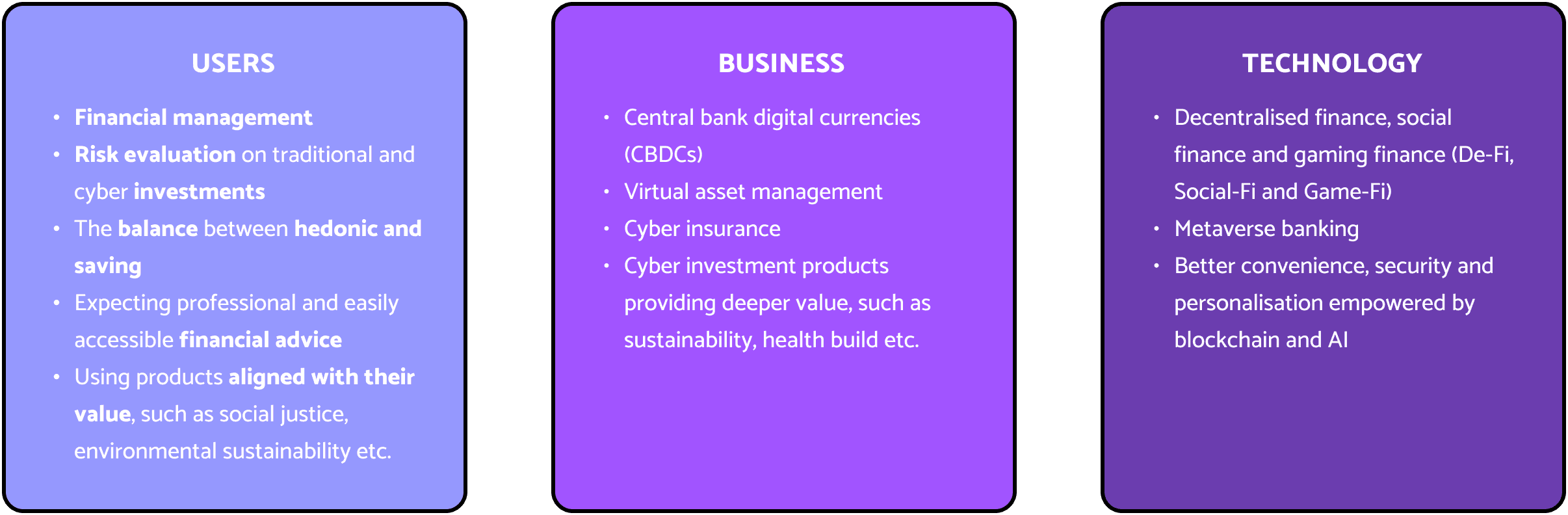
We summarised our individual secondary research findings and talked them through with the team. There are some potential themes that keep reoccurring.
We generated some draft hunt statements based on the findings and themes summarised.
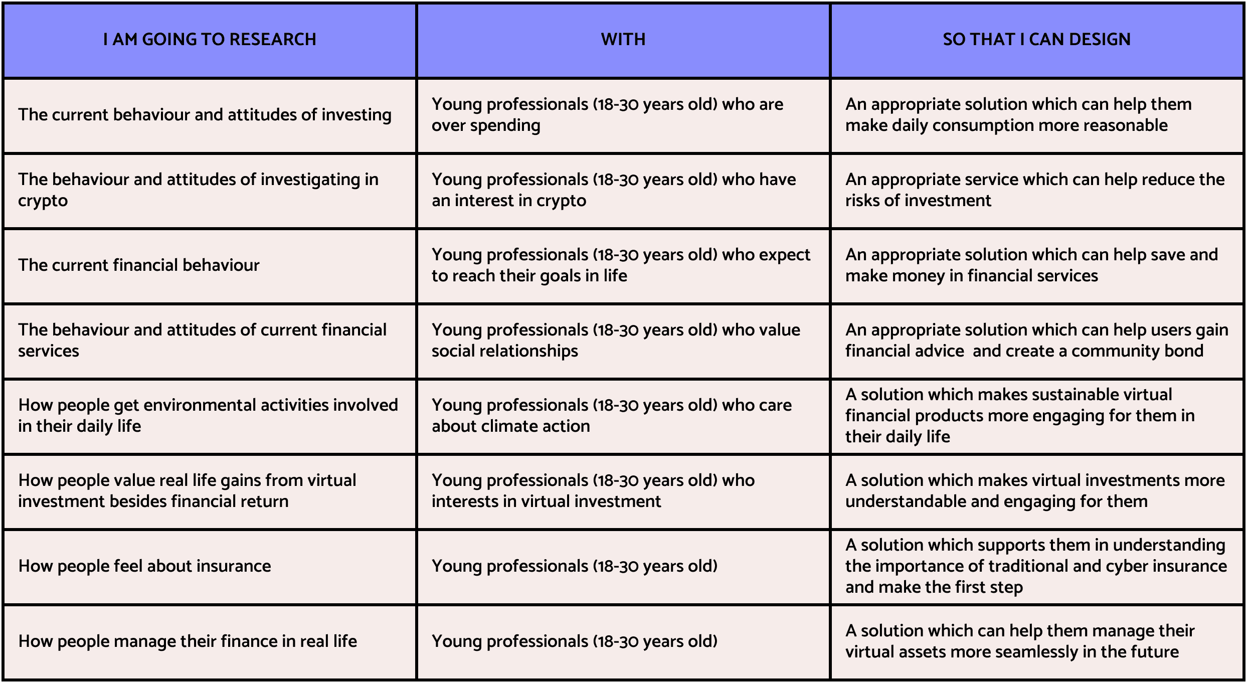
The draft hunt statements served as a tool to narrow down, clearly define and justify what we were researching and why. We did not select a hunt statement to go forward because we wanted this to be determined by the responses and feedback we got from our primary data collection with our target users.
Primary Research.
We planned to conduct semi-structured interviews to better understand our target users and identify a more specific direction for the project. We collaboratively generated a list of questions based on the previous draft hunt statements. The questions were used to get a basic idea of the current practices of the young professionals regarding financial habits, values, opinions about Web3 technologies and any pain points suffered.
Five participants were interviewed which enabled us to collect quick data in an iterative manner. Every team number was assigned the task of interviewing, transcribing and creating notes for the affinity diagram. We used an affinity diagram to analyse the quantitative data, categorise our findings from the interviews, and then extract recurring themes into insights.
We sorted out 16 insights based on the results of the affinity diagram, and then we chose 5 most potential insights through the insight matrix.
Coordinate Check.
We worried the project direction was not what the clients were expecting because we still felt uncertain in the field of Web3 and Fintech. Therefore, we brought the five early insights back to our client Capco to see which one intrigued them the most.
And we were glad that we did. The insights actually did not get the most attention. However, the feedback let us know what they cared about the most. The valuable advice made us rethink, adjust and arrange the next step:
Scope the Target Users
The current user group, young professionals from 18-30 years old, was too broad to find the specific needs. We could bring some details like demographics or exact concerns together to narrow down the target users.
#1
Dive Deeper into the Needs
There are associations between the current insights. Different research methods would be worth a try. Or we could go back to the data, use interpretive phenomenological analysis to dig into the emotions around users’ worries and tickle the pain points.
#2
Prove the Business Value
It was important to show the clients that this project direction would be worth their time and money. Solid facts and statistics would be strong support.
Use More Articulate Language
We should speak in the language of clients. Apart from the business value mentioned above, more concrete examples and accurate expressions would help the clients to understand when presenting.
#4
Once we defined the problem and clarified the insights, it followed the ideation part. Then the general path of the project would be fixed. It would be hard to overturn the progress and start from the beginning, especially for a short-term project. Therefore, it was very crucial to ask the clients for their thoughts in this phase. We should confirm where we were before continuing.
Further Research.
Adapting and responding to changes effectively is the core of Agile. We went back to the interview data. What we were looking for was more concrete needs which could help narrow down our design focus. Then we identified the problem about balancing social life and long-term goals. However, the existing data are insufficient for us to dig into this pain point. We also questioned:
What are the long-term goals of our users?
What is the timespan to divide long-term and short-term goals?
How do the users prioritise long-term goals and short-term goals while saving?
Is the users’ daily expense more socially related or related to other aspects?
Do the users’ daily consumption behaviours really conflict with their saving goals?
Second-round research was desperately needed to make our point more legitimate.
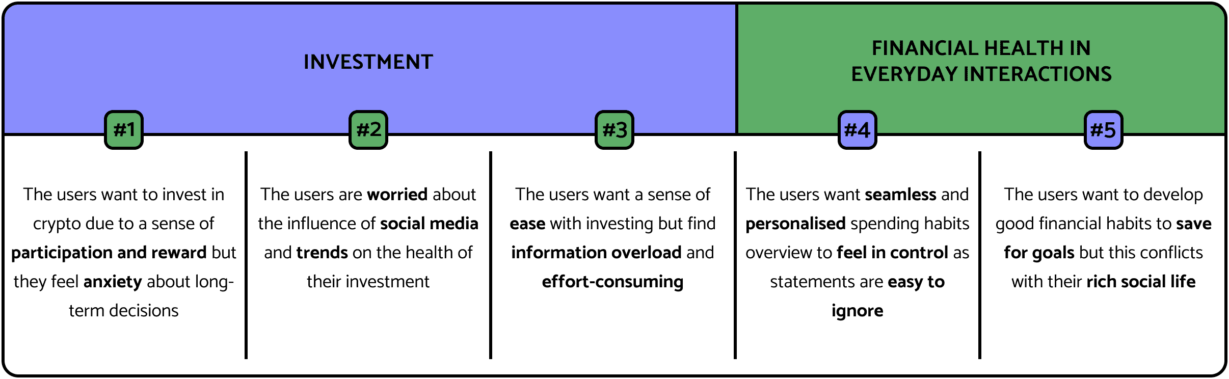
Primary Research.
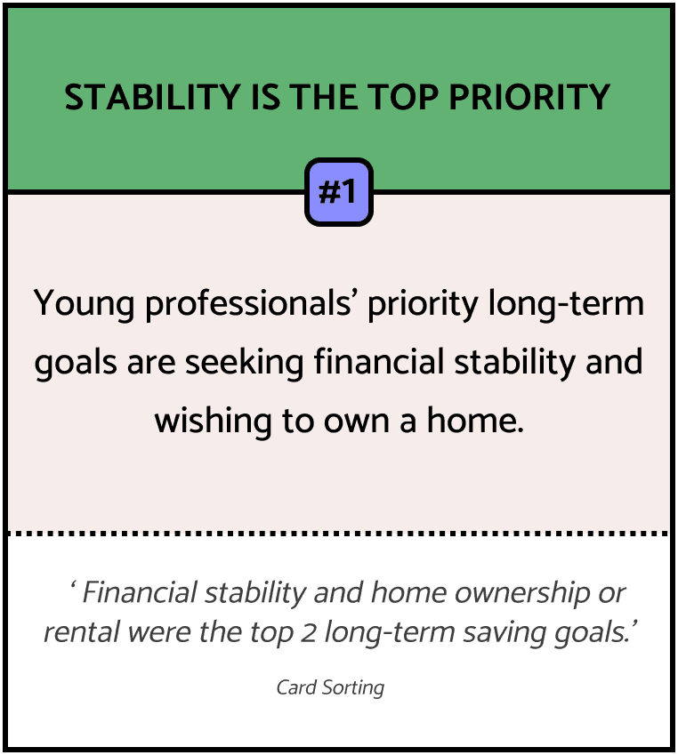
We chose Card Sorting to carry out the primary research. The options were shown with images and captions instead of only text. The images worked as prompts for the participants which made the activity more engaging while improving the efficiency of deciding between the options. Then we used a statistical method to speed up the process of analysing data from the 10 participants. This research let us intuitively understand the top saving goals and daily consumption activities of the users. We found that:
Secondary Research.
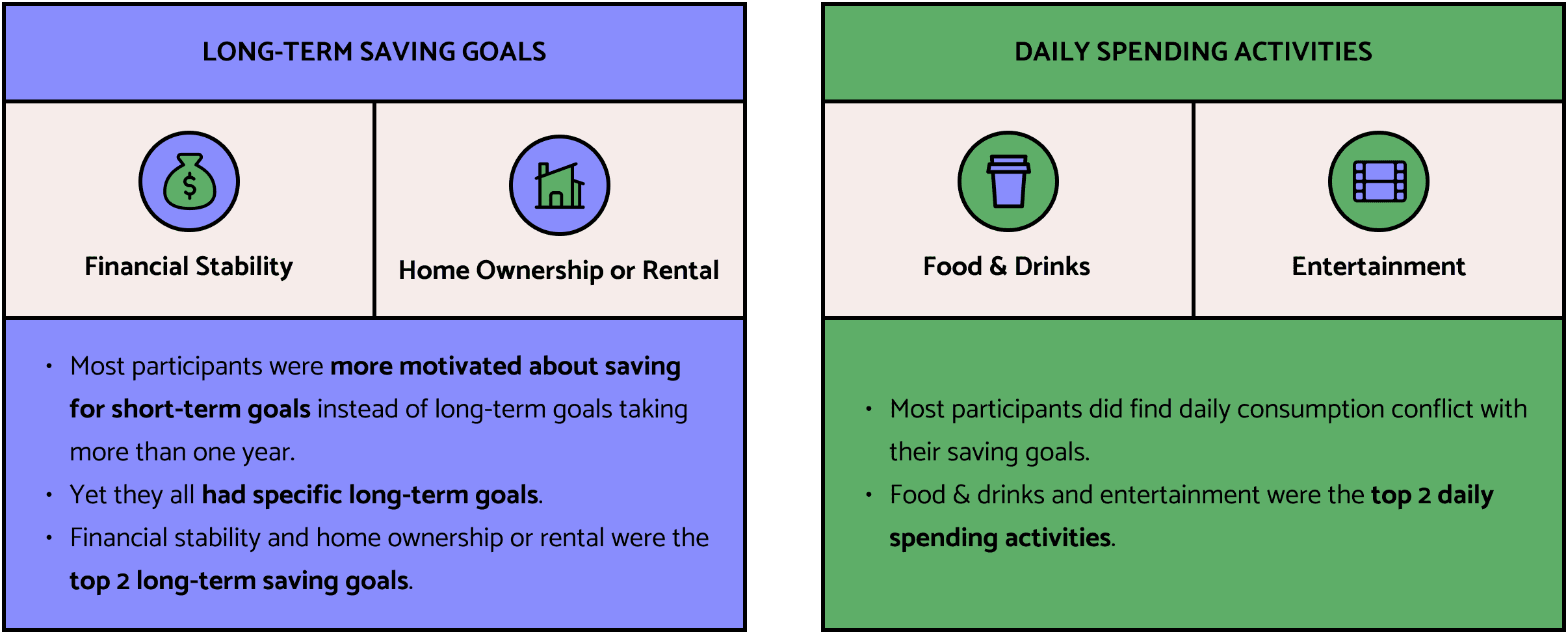
We went back to the previously gathered material to finalise the user group. Some statistics from secondary research enabled us to complement our primary research findings with a broader macro perspective. They also helped back up our user group to ensure it was the one that would be worthy for our client Capco to focus on. The reports indicated that:
In this phase, the user group was almost certain. We were very close to finding our direction instead of navigating into the unknown.
Definition.
Target User.
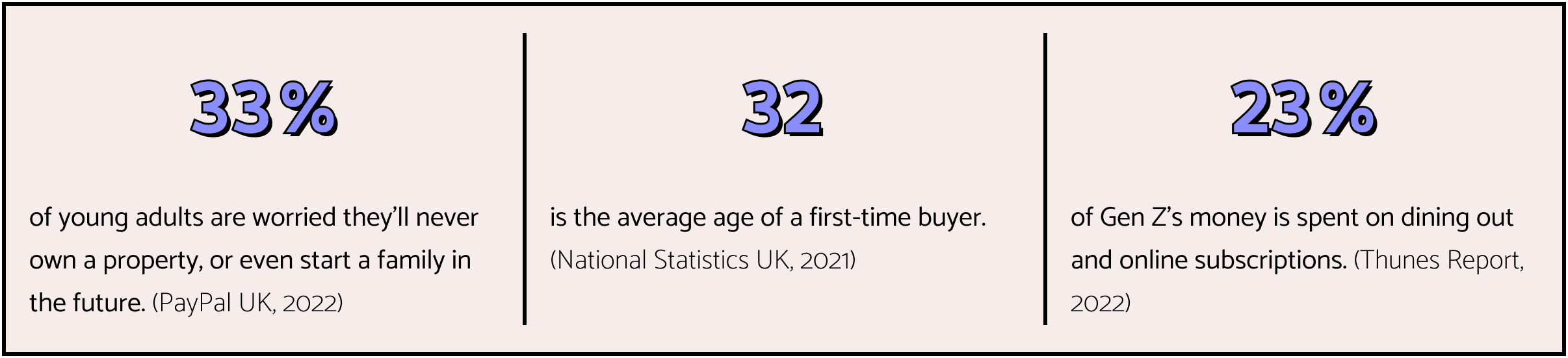
Based on our second-round research, we added more details to our target user to make it more niche. We replaced the age scope with years of seniority because people started having stable incomes at different ages. The refined target group was
Deeper Insights.
We extracted recurring themes into insights based on research data. The following insights were selected which were most applicable to our user needs as well as potential for alignment with the client’s topic given.
How Might We.
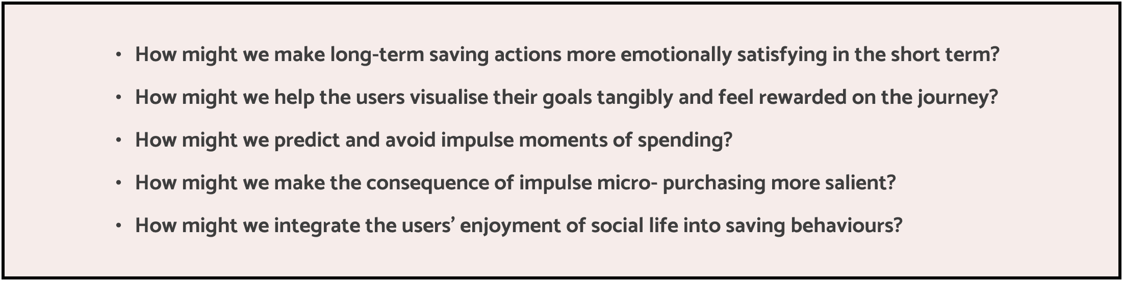
Based on the insights, we generated HMW statements to explore the opportunities. From the perspective of business outcome and user experience, we evaluated all the statements on a matrix and narrowed the scope to the ‘sweet spot’.
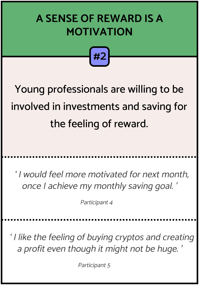
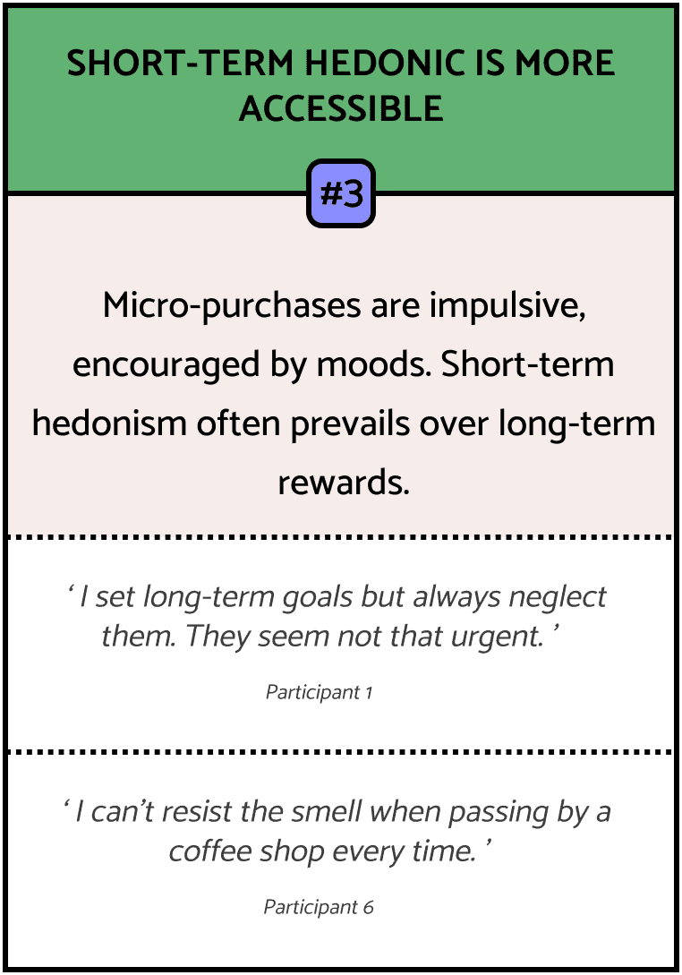
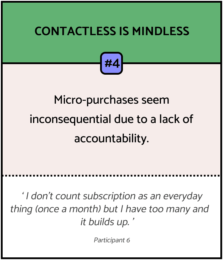
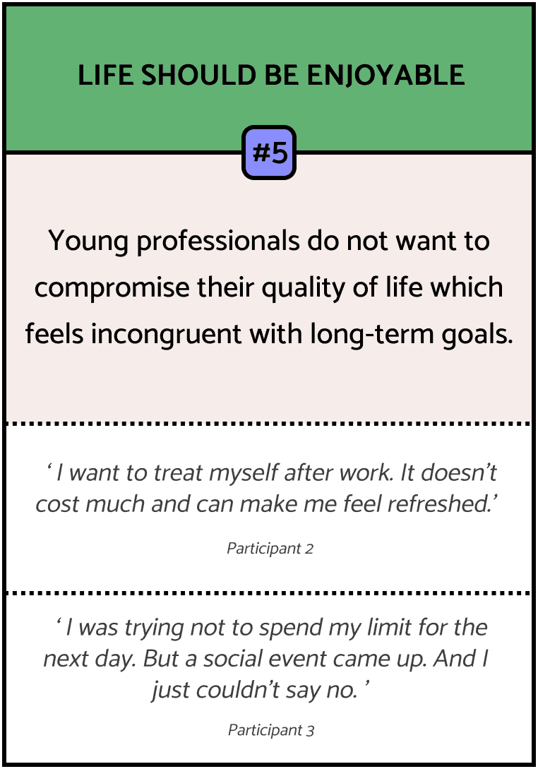
The unreachable pay-off feeling, the pile-up of micro-purchases and the conflict with hedonism all hindered users from starting or persisting in working towards their long-term financial goals. Facing all the dilemmas, we found the opportunity. The question mark lingering in our mind evolved from the initial question brought up by Capco to a more specific one.
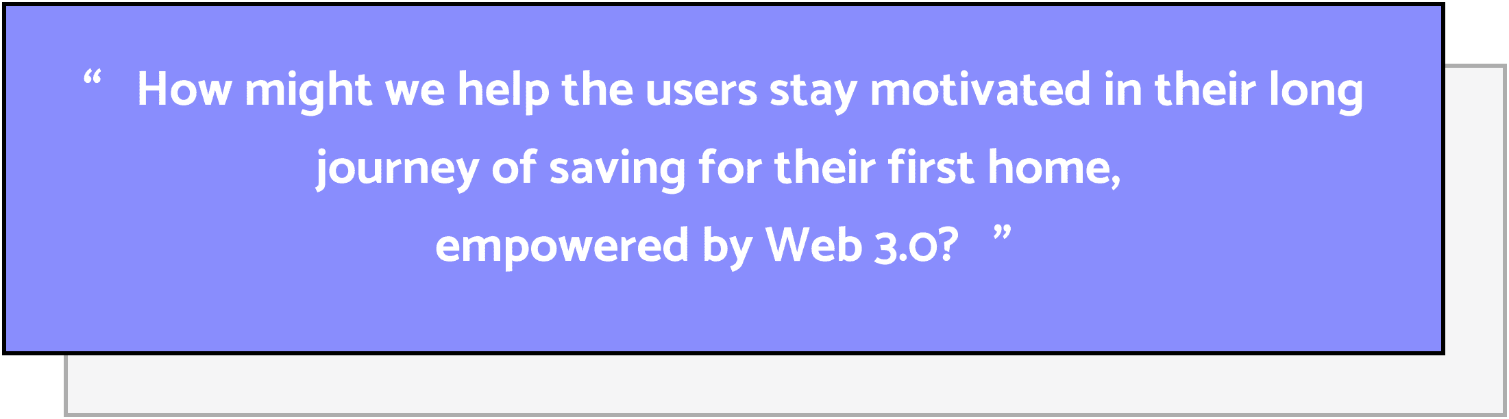
The questions below were from the ‘sweet spot’. They worked as the prompts for the following ideation parts.
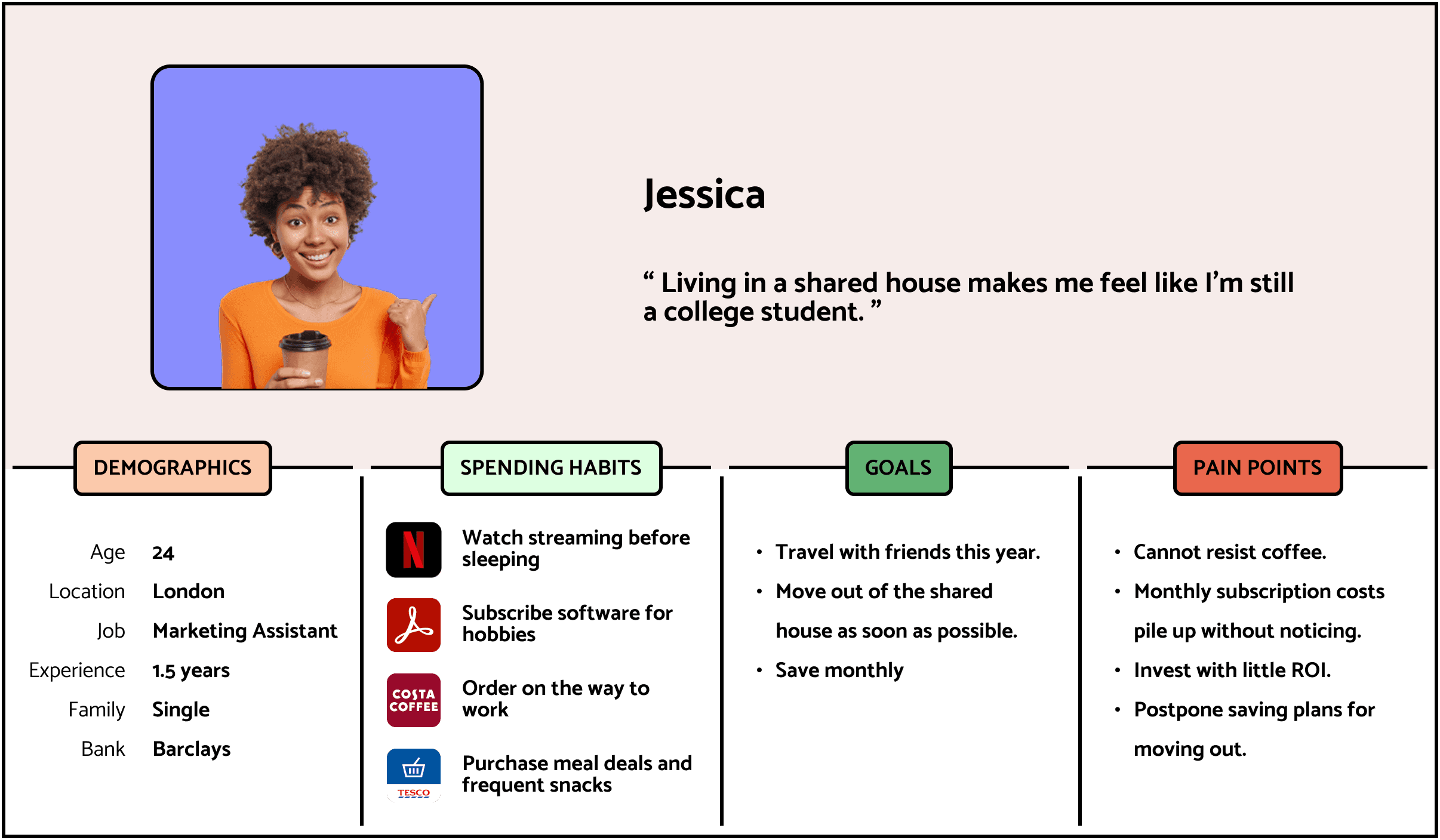
Persona.
To help the client better empathise with our users, we came up with the persona Jessica. Jessica as a user character, worked along with the group and enabled us to adapt to various scenarios more easily in the concept development as well.
The project direction was very clear in this phase. We would steer down the path and explore for the destination.
Development.
Early Concept.
In our ideation design sprint, we used Crazy 8’s as the main method, along with a series of brainstorming cards as prompts from the perspective of technology and business. Each team member created 8 ideas on paper within 8 minutes based on each HMW.
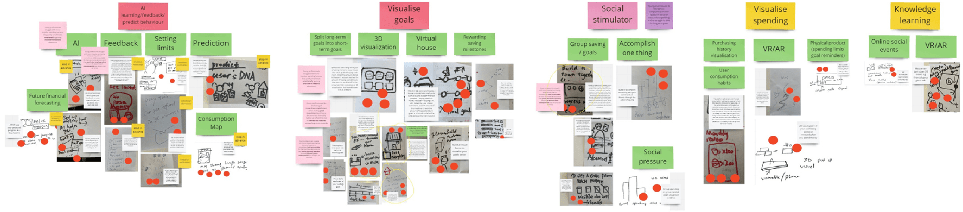
Then we went through the ideas together, categorised and selected. In the context of Web3, the concept presented to the client should be potential and futuristic but humanistic and feasible. After several rounds of adjustment, we settled on two concepts.
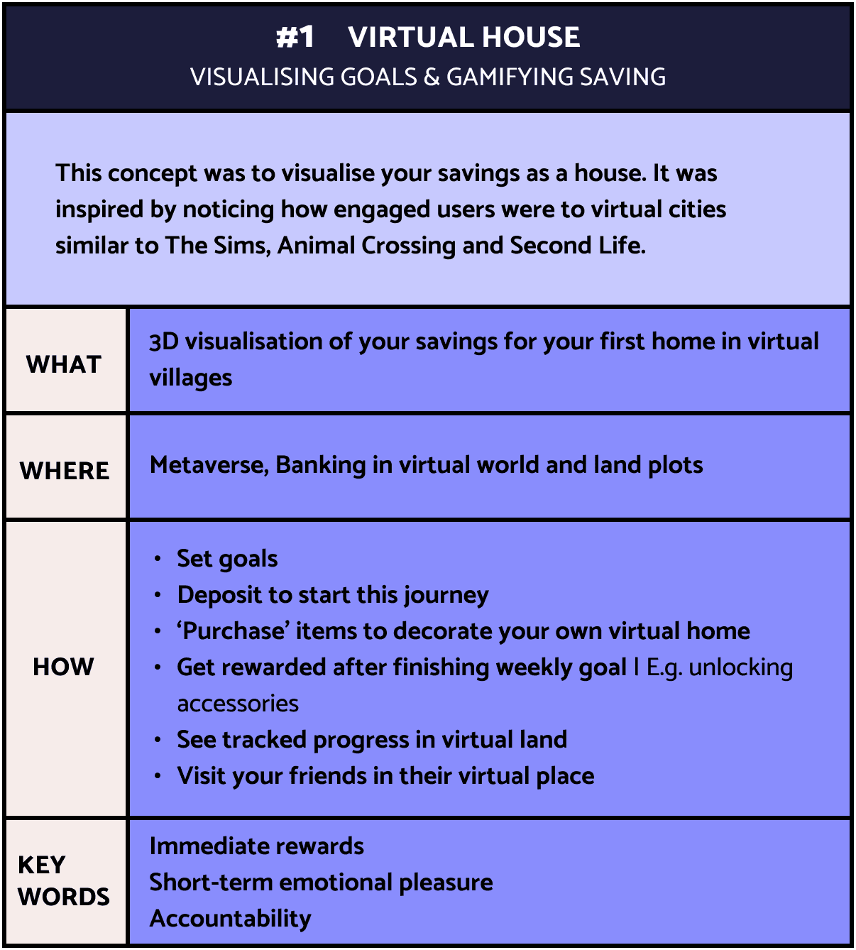
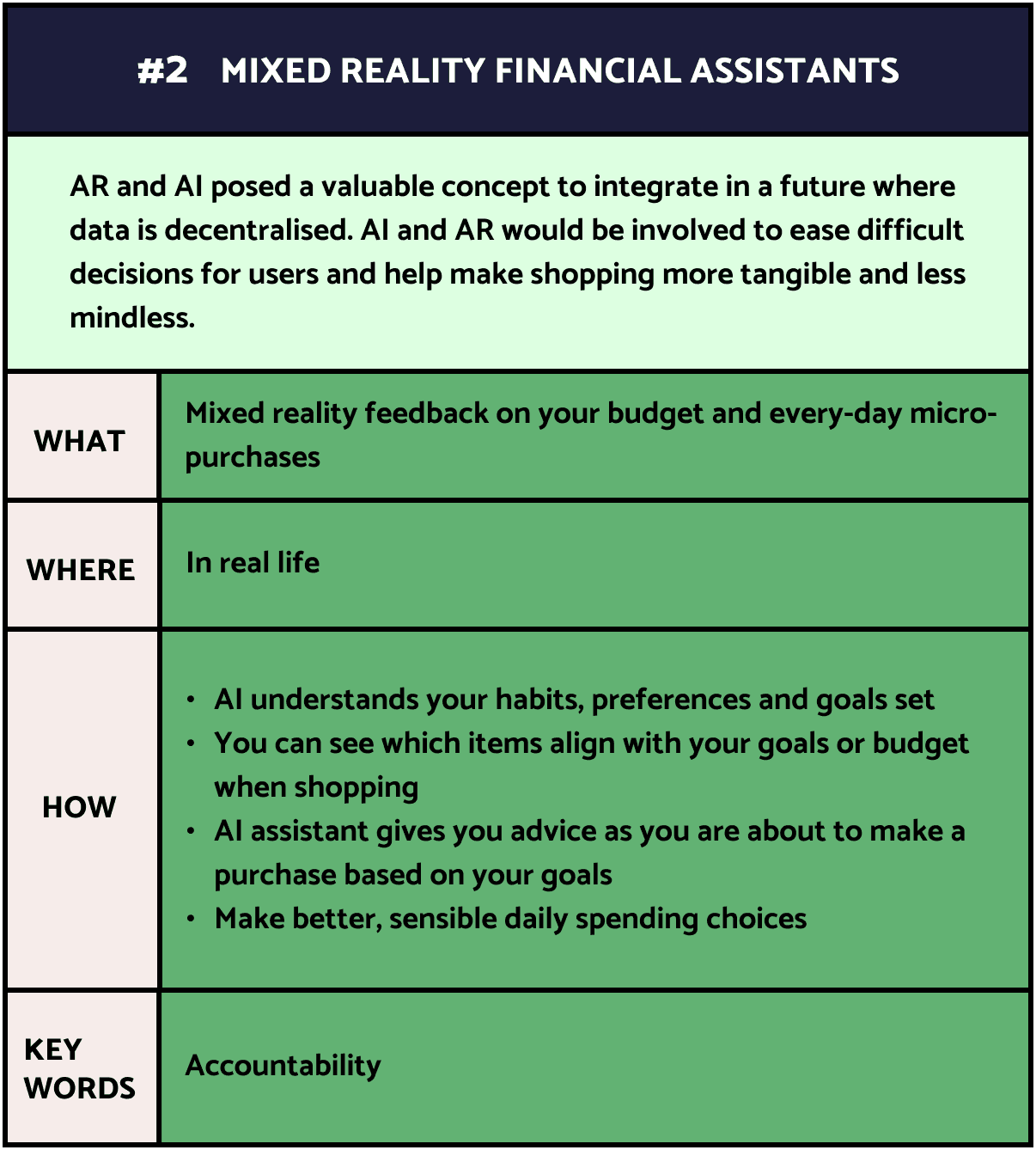
Concept Evaluation.
Our client Capco liked both concepts overall, especially the concept of the 3D visualisation ‘digital twin’ house. They could see that both concepts would be realised soon and loved how the virtual house concept could intertwined with the physical world. Yet there were things that they were expecting more. We would take them into consideration in the further development.
Positivity
Move away from the idea of blaming the new generation users for their inability to save as it was a popular sentiment in media. Don’t ‘dictate’ to young people but encourage them instead.
#1
Accessibility
Widen the persona to be prepared for further user acquisition in subsequent product development and upgrades.
#2
Trade-off
Instead of overdoing some features, how to balance among the user goals and user experience is important. Excessive reminders from the mixed reality financial assistant may be annoying for users and then be ignored. In a long-term vision, it could make the users lose confidence in the service.
#3
Safety
Decentralisation means that users have more control over their data in Web3. It is important to consider what data sources will be combined and their accessibility. Apart from data safety, we also need to think about the risks of the service. For example, how to reduce feelings of comparison and prevent cyberbullying in the virtual house community.
#4
After receiving the client's feedback, the team was inclined towards the virtual house concept. To reduce bias, we wrote down and compared the pros and cons of the two concepts to decide the direction.
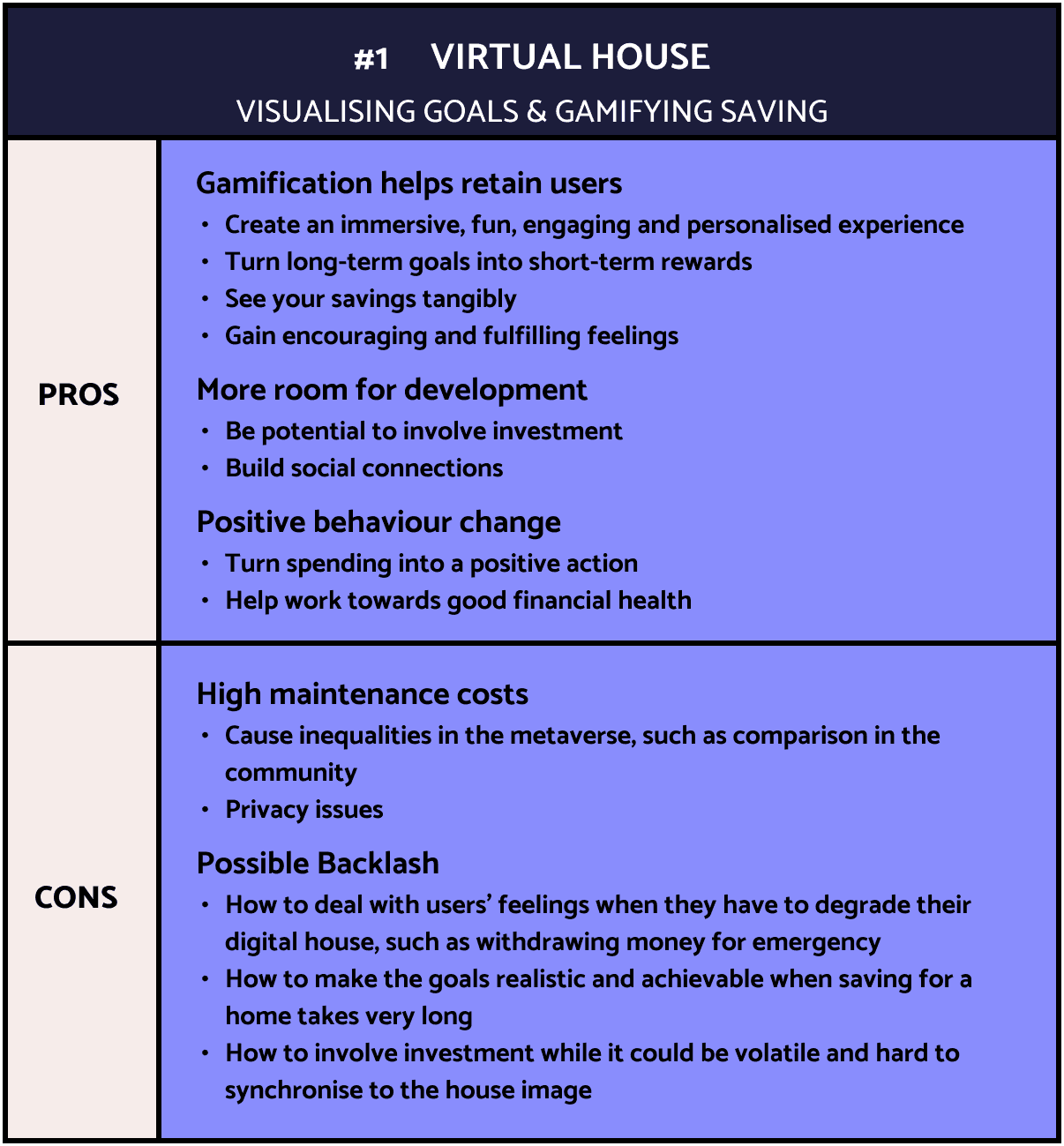
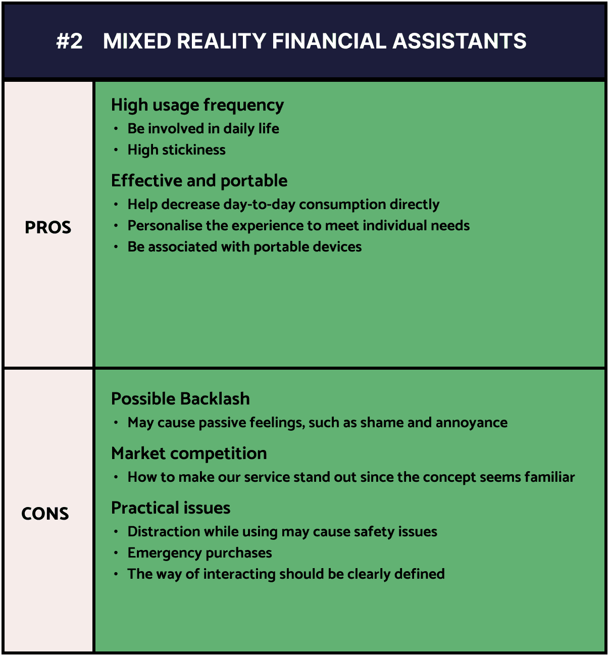
Due to the time limitation and the methodology of Agile, the project was progressing very fast and iteratively. It was inevitable that some felt uncertain or had concerns about the results reached so far. After the huge milestone of confirming the product concepts, it would be hard to make a U-turn. Therefore, apart from avoiding bias, evaluating the concepts from a personal perspective also provided a great opportunity to vent everyone’s opinions and keep the team on the same page.
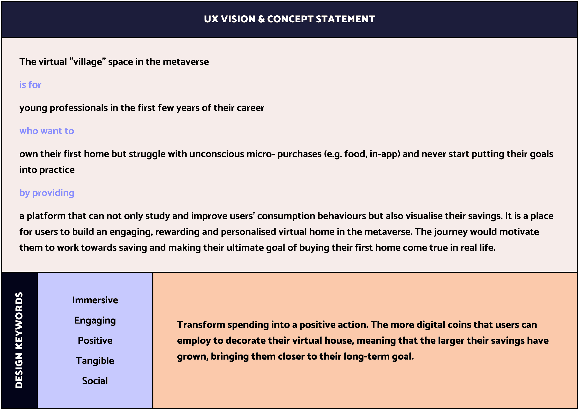
UX Vision.
After discussing the pros and cons of the two concepts, we decided to integrate part of MR financial assistant features into the virtual house to reinforce the concept and expand the usage scenarios. We completed the UX vision as the overall roadmap to follow.
Prototype & Iterations.
In this phase, we experienced four rounds of prototype iterations. It was an intense but rewarding journey. We used the storyboard, service blueprint, user flow and sketchy wireframe to express our product. The iterations were mixed with timely usability testing, such as user interviews and body-storming.
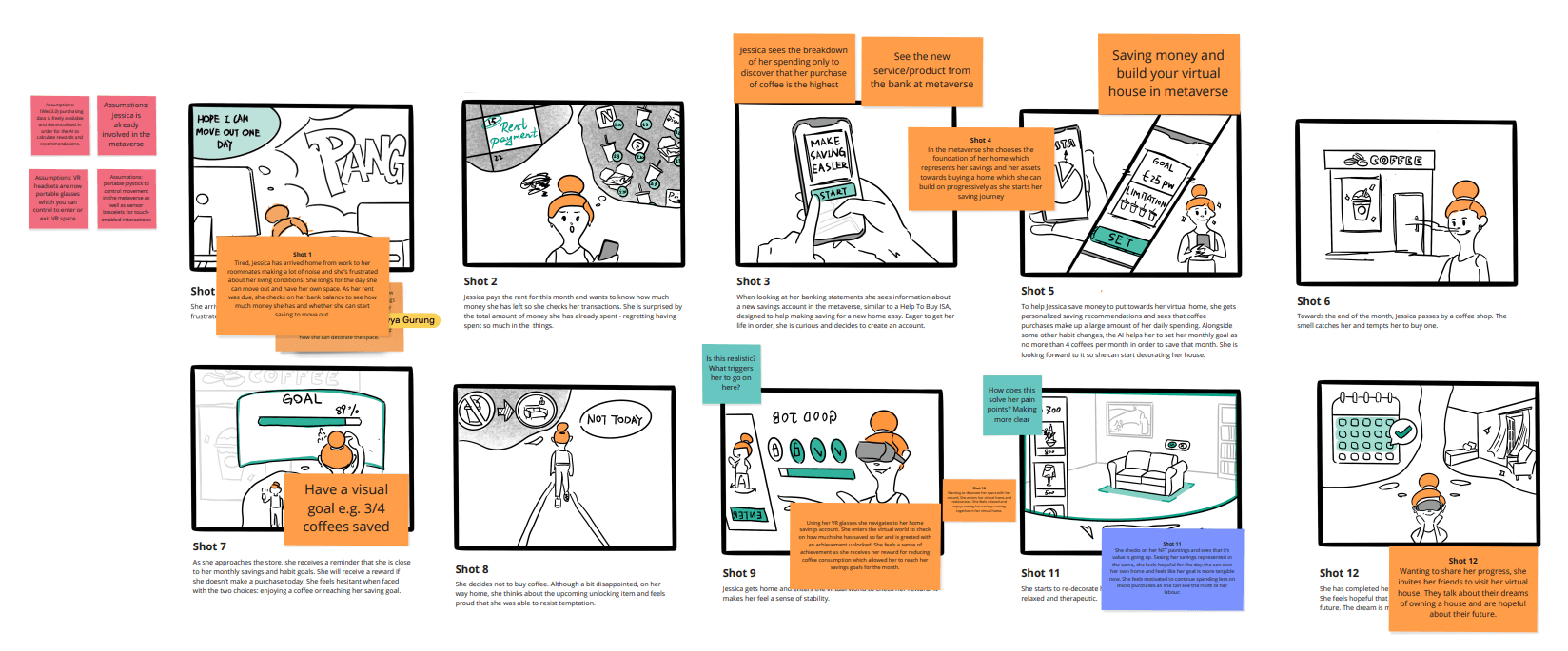
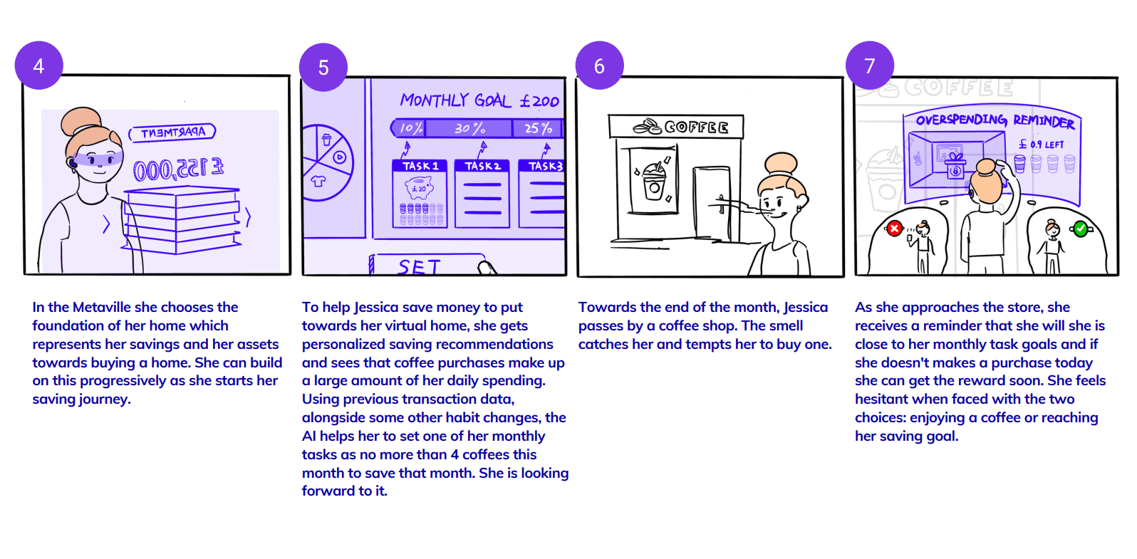
Storyboard was our main way of prototyping which ran through this entire phase. Because it would be the quickest way to engage our clients Capco into our ideas.
Storyboard 1.0
As our concept is a combination of product and service, we used a service blueprint to comb the steps for using our product. This also covers all the features of our product. Doing the service blueprint together enabled us to refine and list the detailed features. Although the target users have owning a home as an ultimate goal, the endpoint of the map is concerned with accomplishing staged goals like saving a certain amount every month. This is because saving enough for a home could take a very long time. We decided to focus on the initial stage of product development. We must define the scope of our project clearly due to the time limitation.
Then, we started with creating a story script. It was a low-fidelity way of expression which had high flexibility. When creating the story, we had concerns about balancing the presentation of the detailed features and the story's effectiveness. For example, whether the plots of deposit and withdrawal of the savings should be covered. They would make our story more coherent and make the product better understood. Yet, it would make the storyboard too complex.
Therefore, we used the MoSCoW matrix to comb the feature based on the user experience goals. This enabled us to limit the scope of our product and put ourselves into the user’s shoes to focus on priorities. In this way, we sorted out the main features.
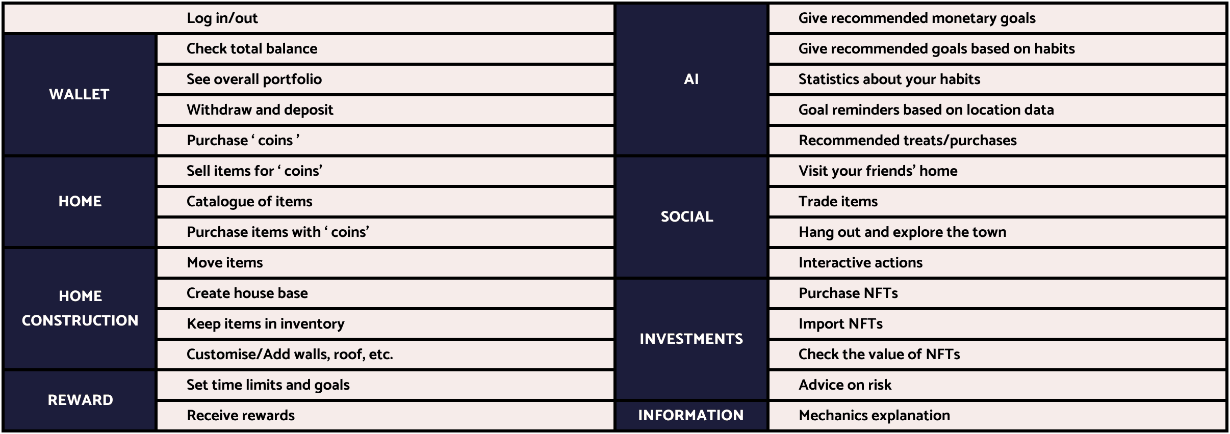
Although the features listed were informative, the group found that there were cognitive gaps between each other. Some members wondered how to deposit savings, how to set a goal and what if users failed to the staged goal. Some felt uncertain about the game logic in detail, such as the exchange rate between the real savings and game coins. The other was concerned about how to price the digital furniture since it would be inconsistent with reality if the price was low or the users would feel less motivated to continue if the price was high. So we used flowcharts to clarify our user flow, determine the game mechanism and check if any details were missing in different scenarios. It enabled the group to be on the same page and be more confident when facing questions from the clients and users later. After the practice above, we finally finished the story scripts and the draft storyboard.
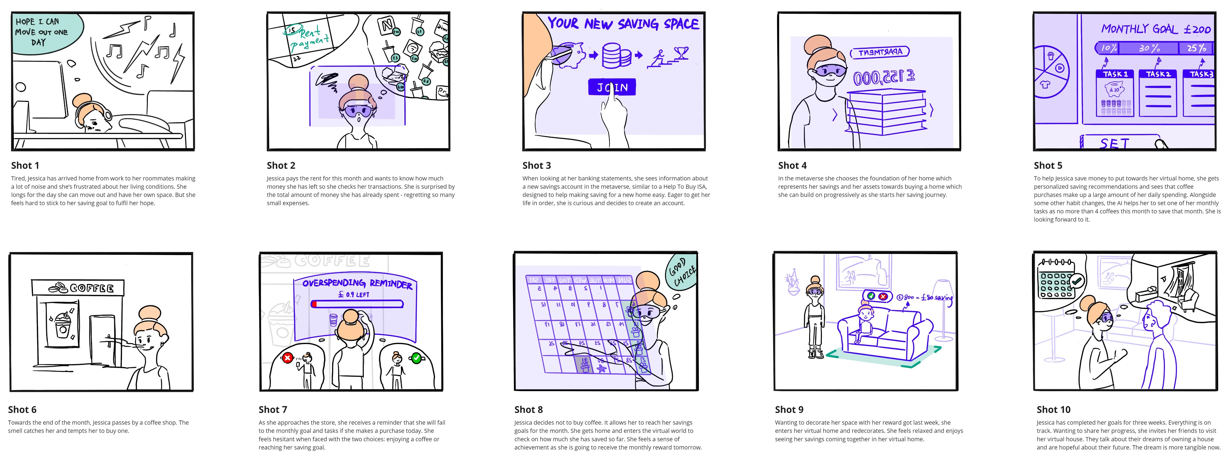
Storyboard 2.0
We brought the storyboard back to the participants who took part in our primary research before for some quick feedback. The questions for the interview were generated based on three aspects: the scenarios of the storyboard, the product features and our concern about the initial storyboard. For example:
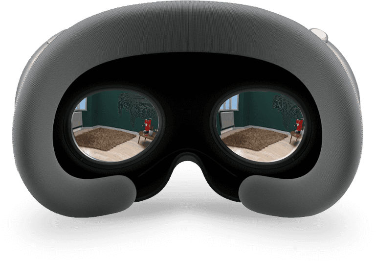
How do they think about using the VR headset as medium equipment?
Can the pseudo-purchasing action for the virtual house replace part of the hedonic from micro spending in real life?
Are there any unclear parts about the flow of the whole story?
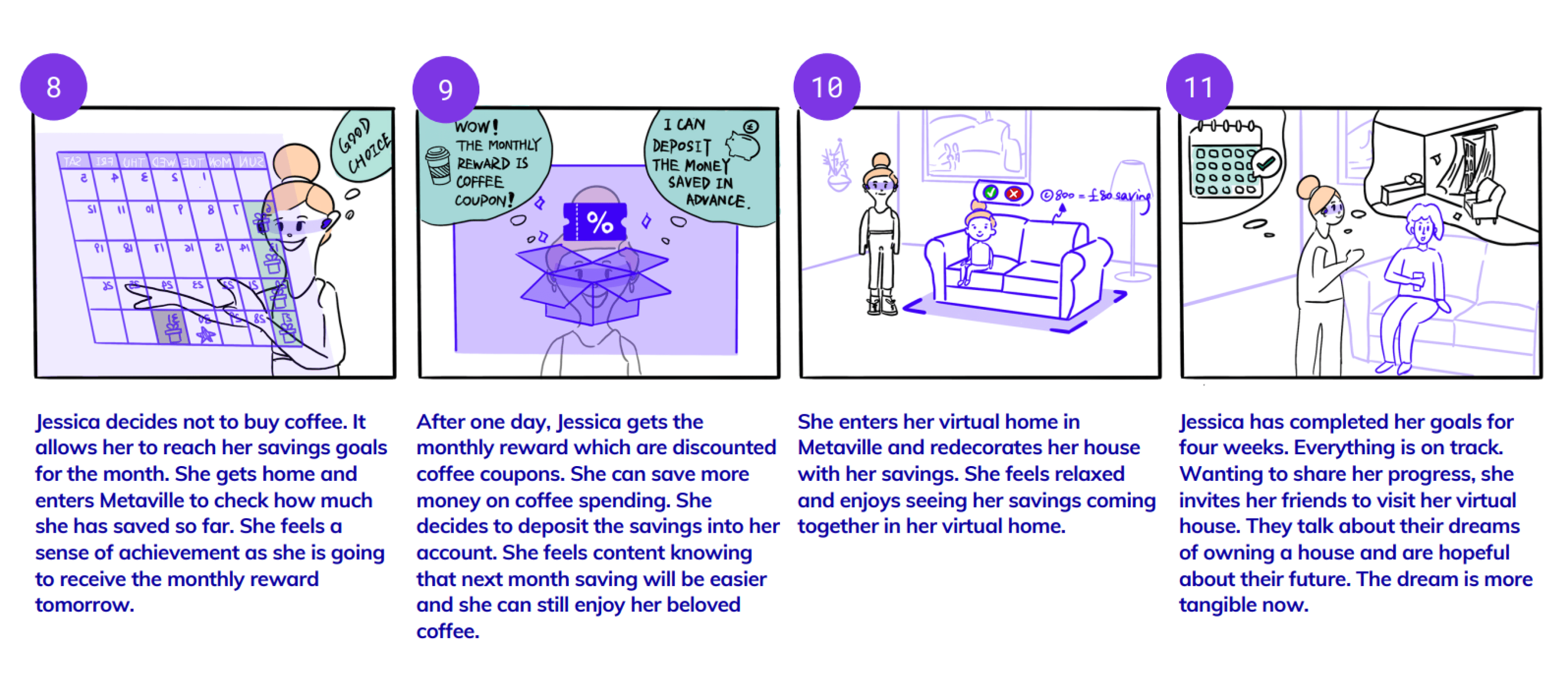
We picked out the key points and categorised the feedback into two groups, product feature and storyboard content. Overall, the participants could see themselves using the product and they responded well to the social features but the storyboard required clarity. There were plot sequence issues. More explanations were needed between steps. And the presentation of rewards and incentives needed to be strong. The participants also mentioned automatic depositing. Due to time limitations, we only revised the script of each shot based on the feedback instead of the whole drawing.
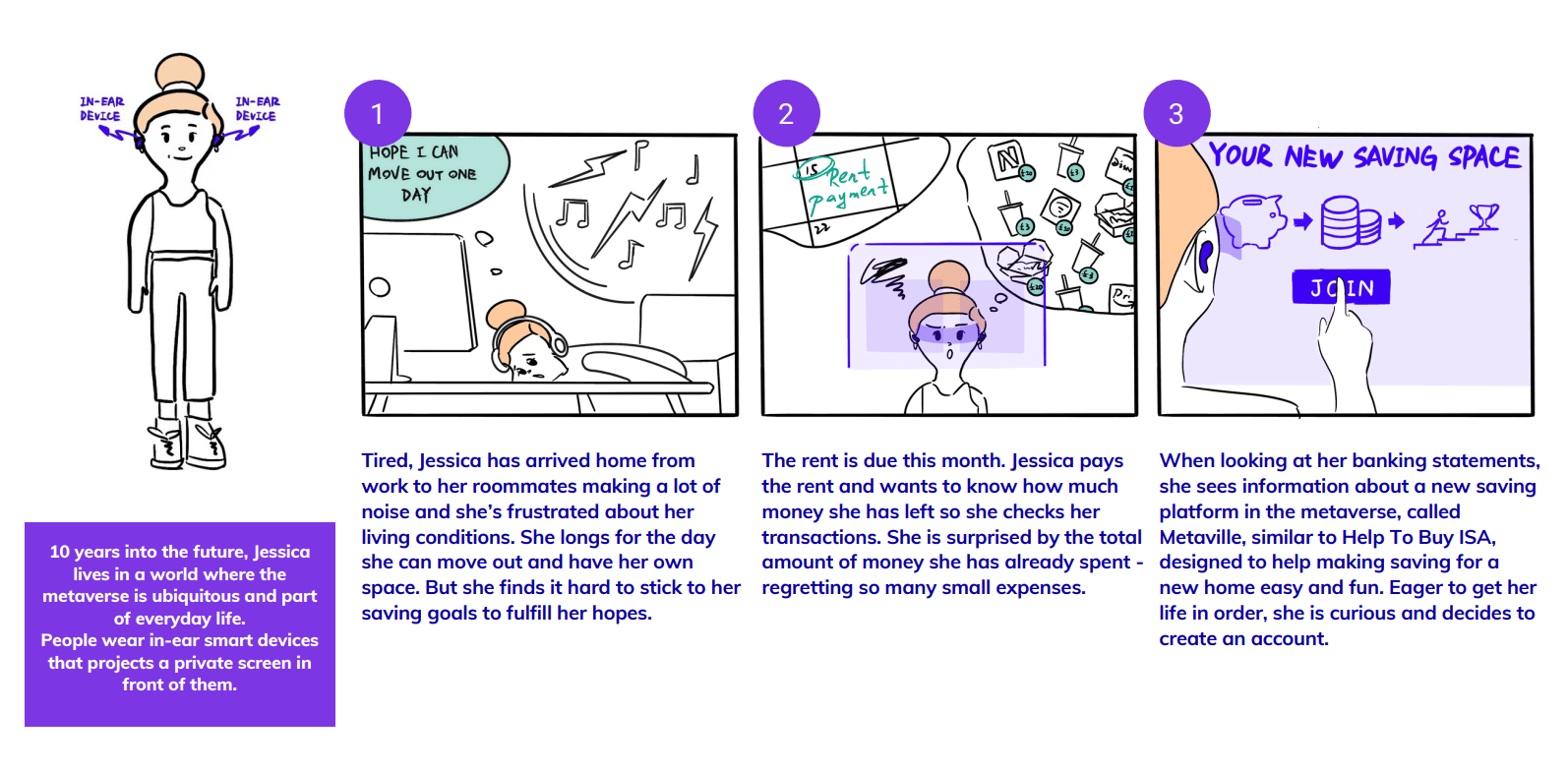
Storyboard 3.0
We did the body-storming to evaluate the storyboard again. We generated some draft interfaces using a mixture of paper and digital prototyping from shot to shot as the storyboard involved with the main interface. They helped us experience the story better when body-storming.
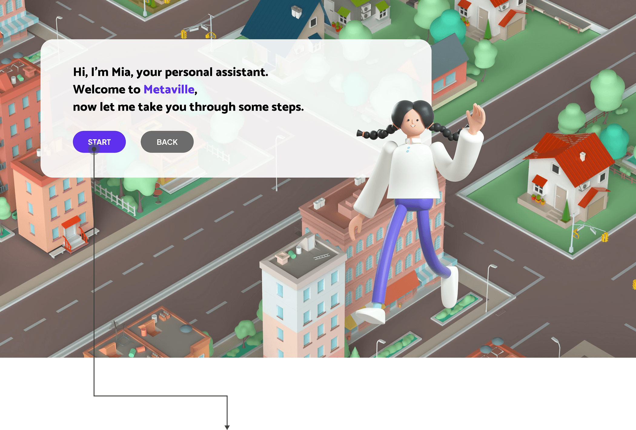
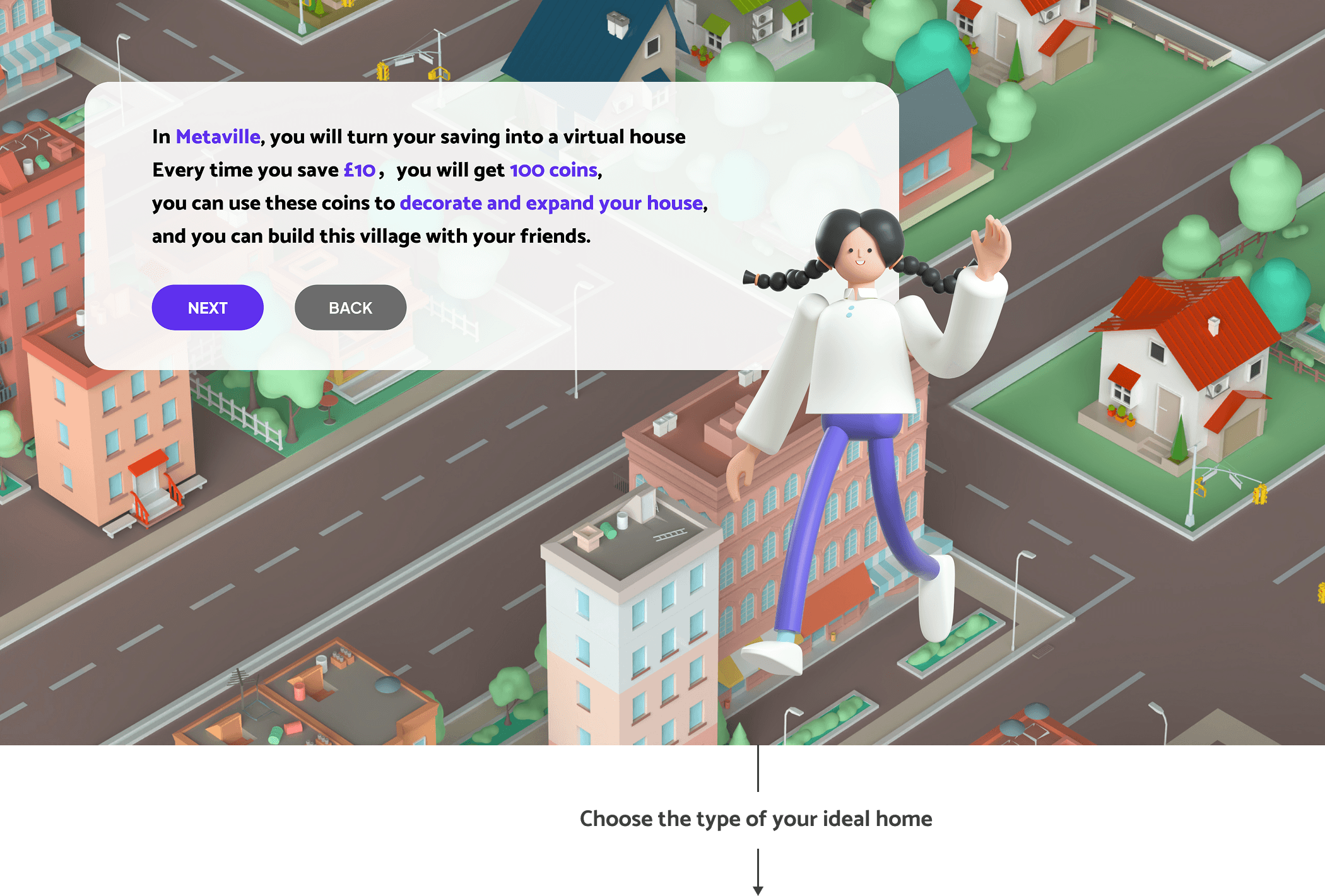
From body-storming, we reconsidered the trigger that prompted our character Jessica to use the product. We also confirmed wearable equipment and VR headsets as our main touchpoints. Some mechanism was adjusted, such as the timespan of goal setting and reward receiving and the frozen term of the deposit saving. Finally, we came up with a name for the product. We called it Metaville.
Storyboard 4.0
We still had concerns about the story spanning too wide a time span thus rendering it less effective. To our surprise, the clients were happy with the time span. Yet they advised that we should point out why Metaville would be better than the existing budgeting apps and know how to sell it.
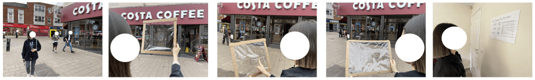
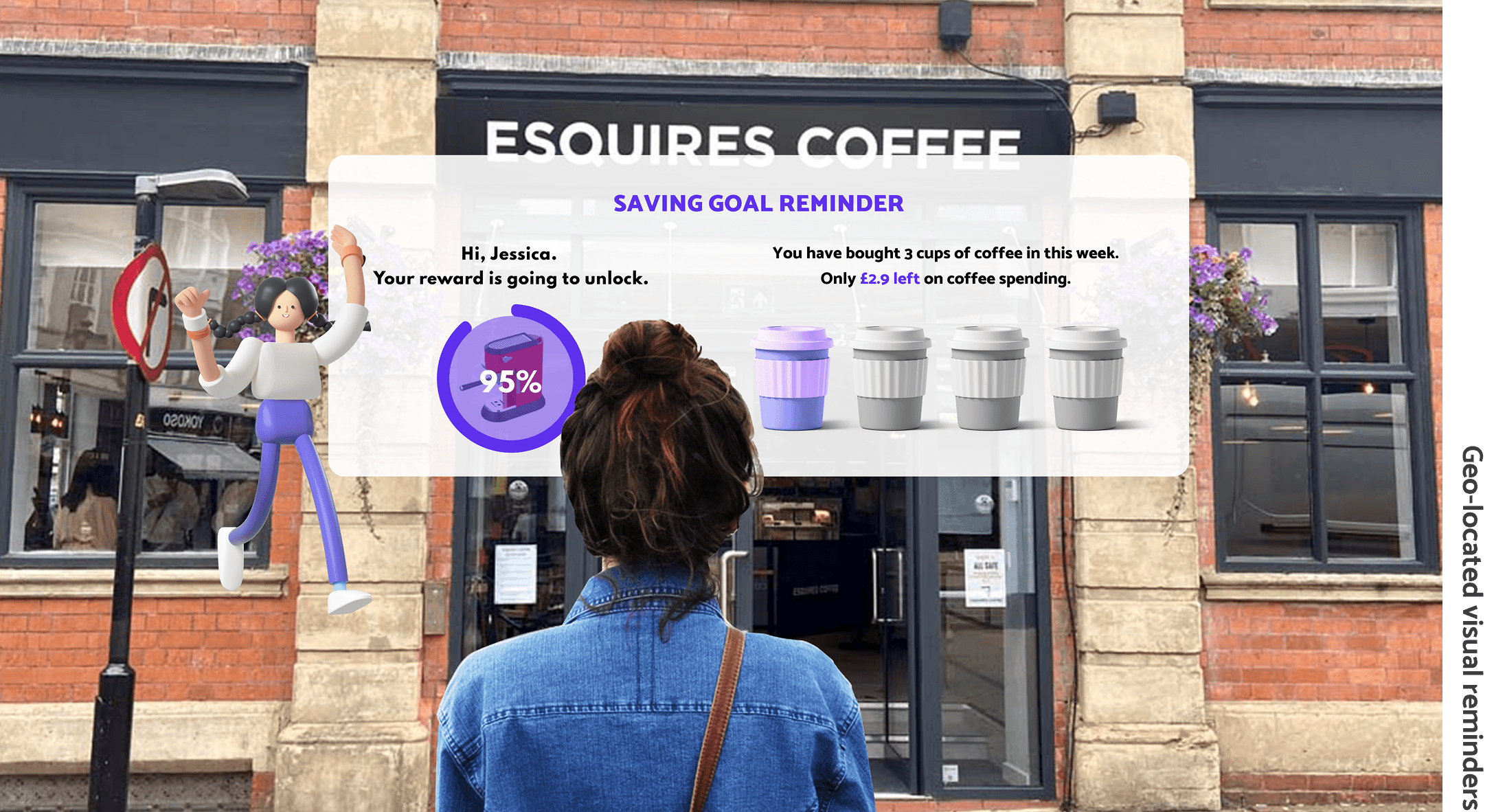
The final user test was body-storming with our participants. This time we did the body-storming in a more realistic context such as in a real coffee shop and one of the group members' own home. The feedback was overall very positive. We only got one advice, but a brilliant one. The participants expected a mixture of virtual and real-life rewards. The group came up with the idea that real-life rewards could be personalised based on users' spending habits. For example, for our character Jessica a coffee coupon could provide strong motivation. The idea also coincided with the theme of Metaville.
“ Metaville is not a fantasy bubble in the digital world but a path intertwined with the physical world. It aims to make users happy and grounded in real life as they achieve their long-term goals step by step. ”
Based on all the feedback, we made some last adjustments. We added some content about Jessica’s behaviour change after using Metaville and improved the consistency of the interface in the story.
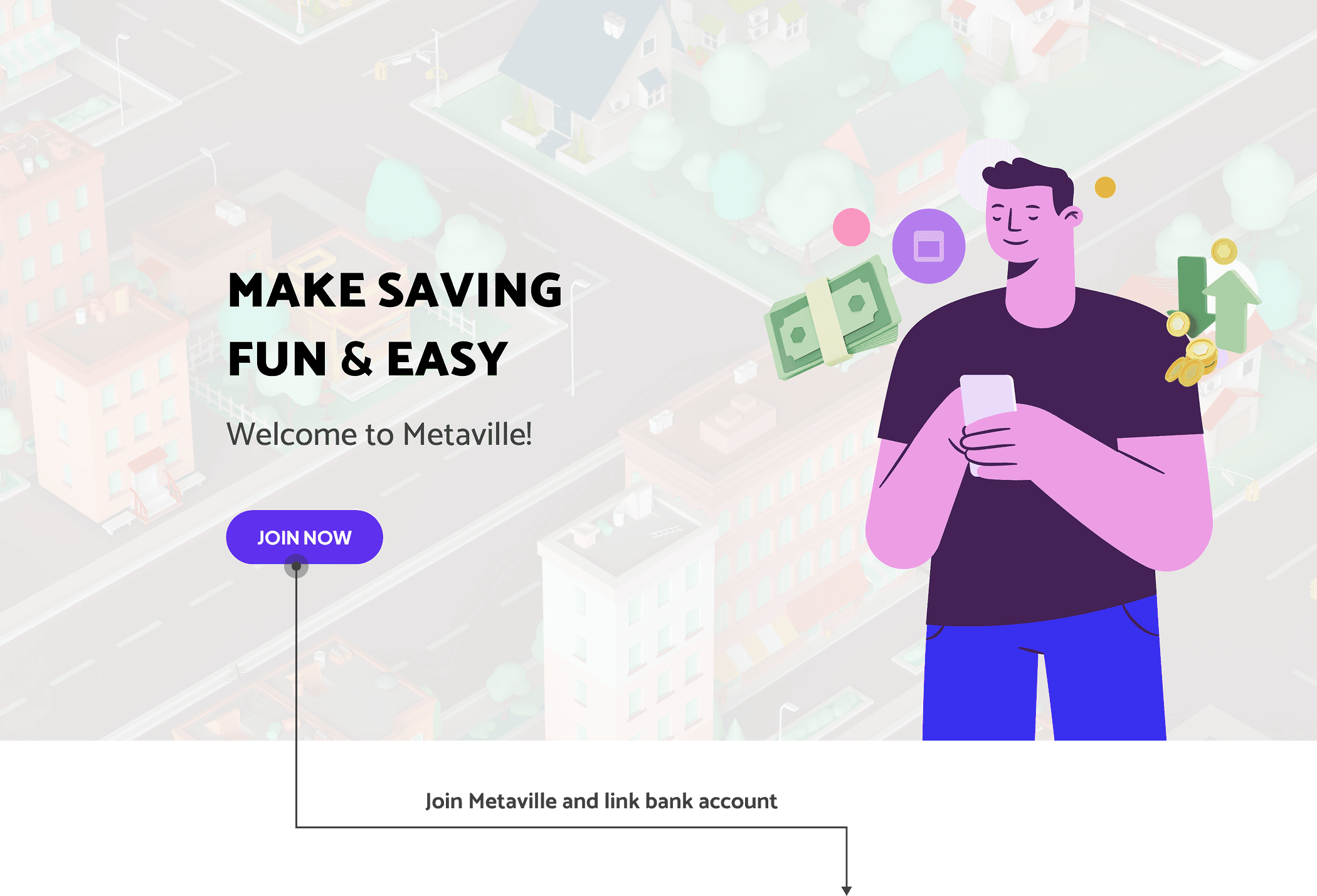
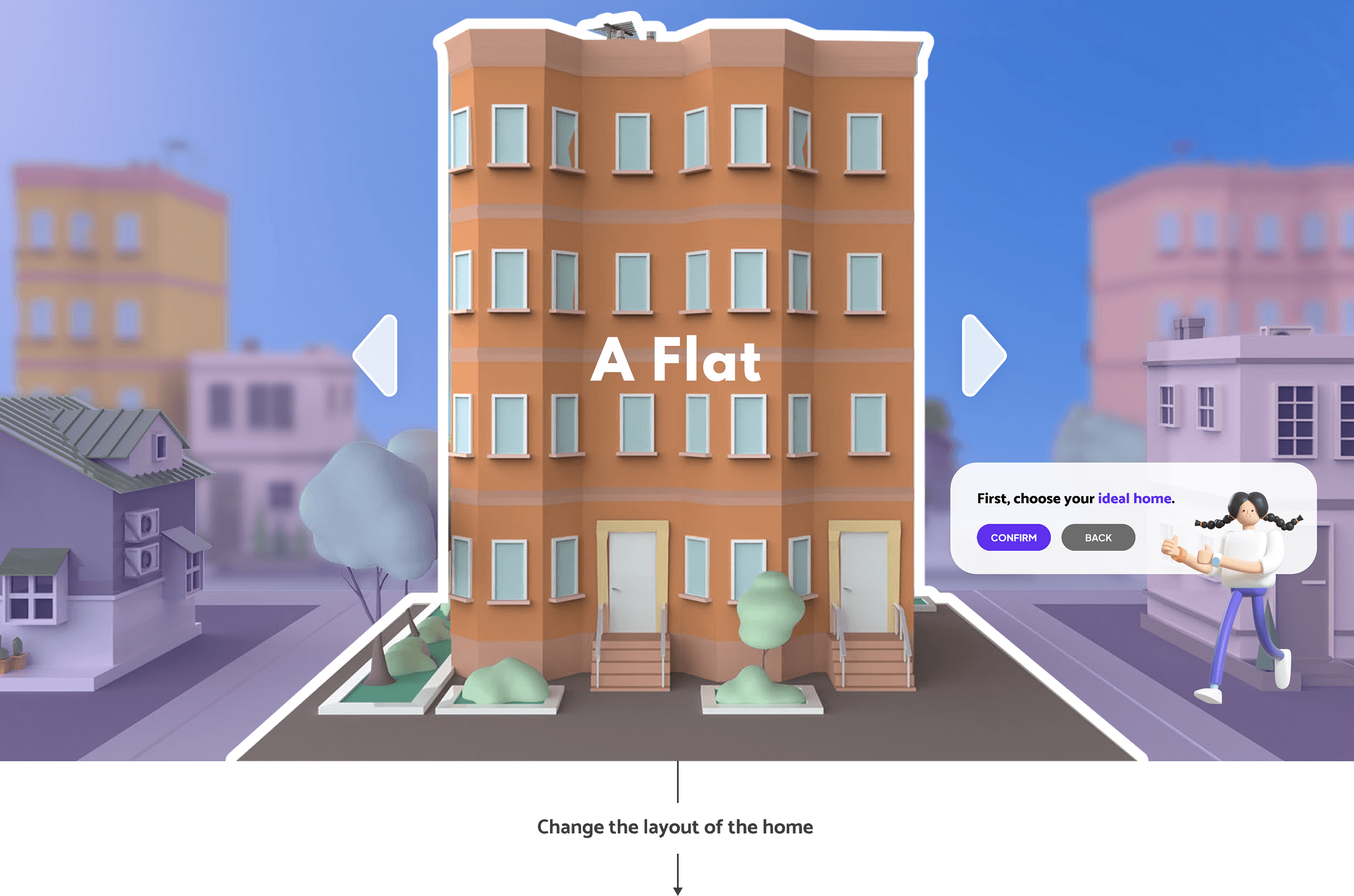
Delivery.
Storyboard.
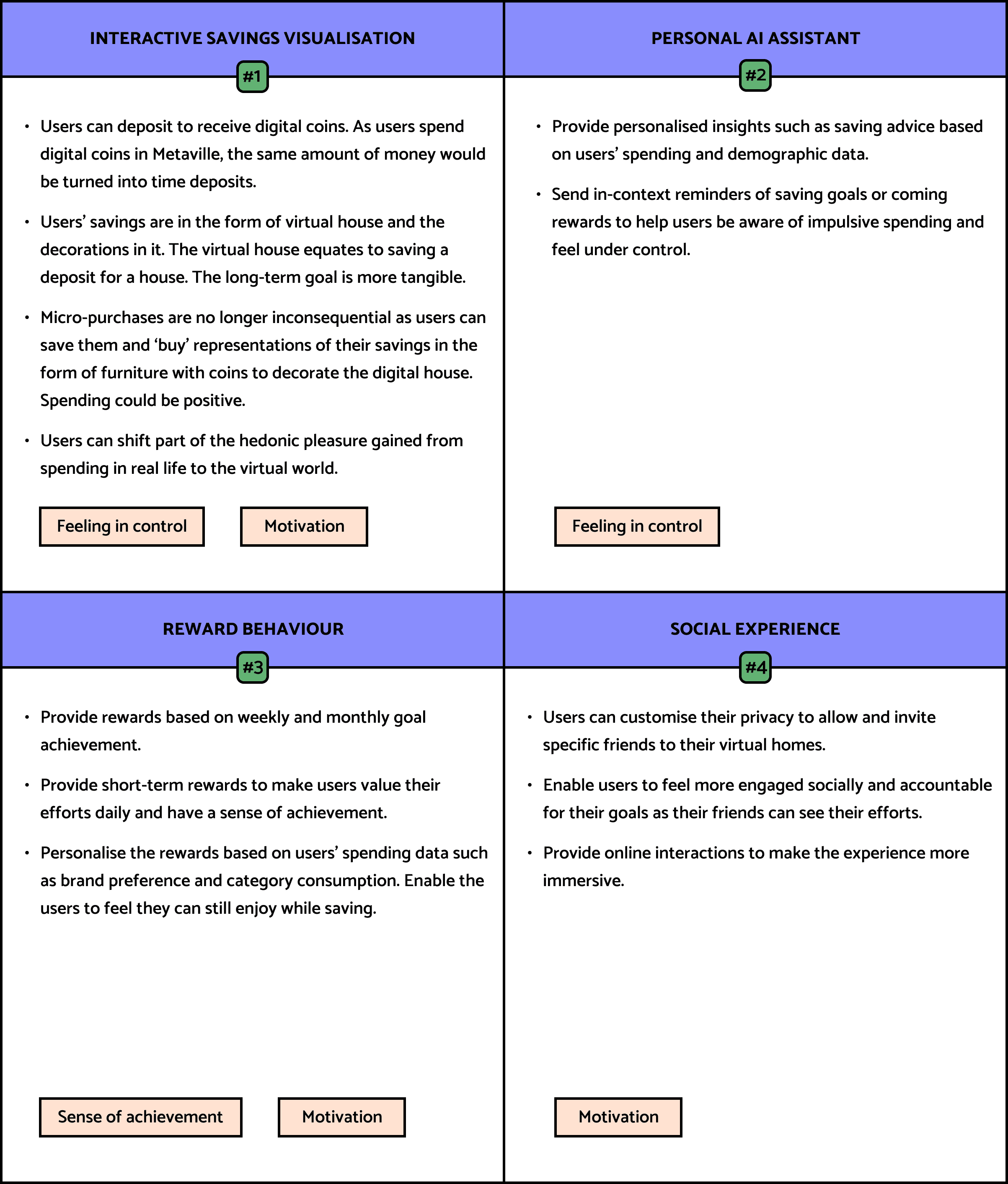
Key Features.
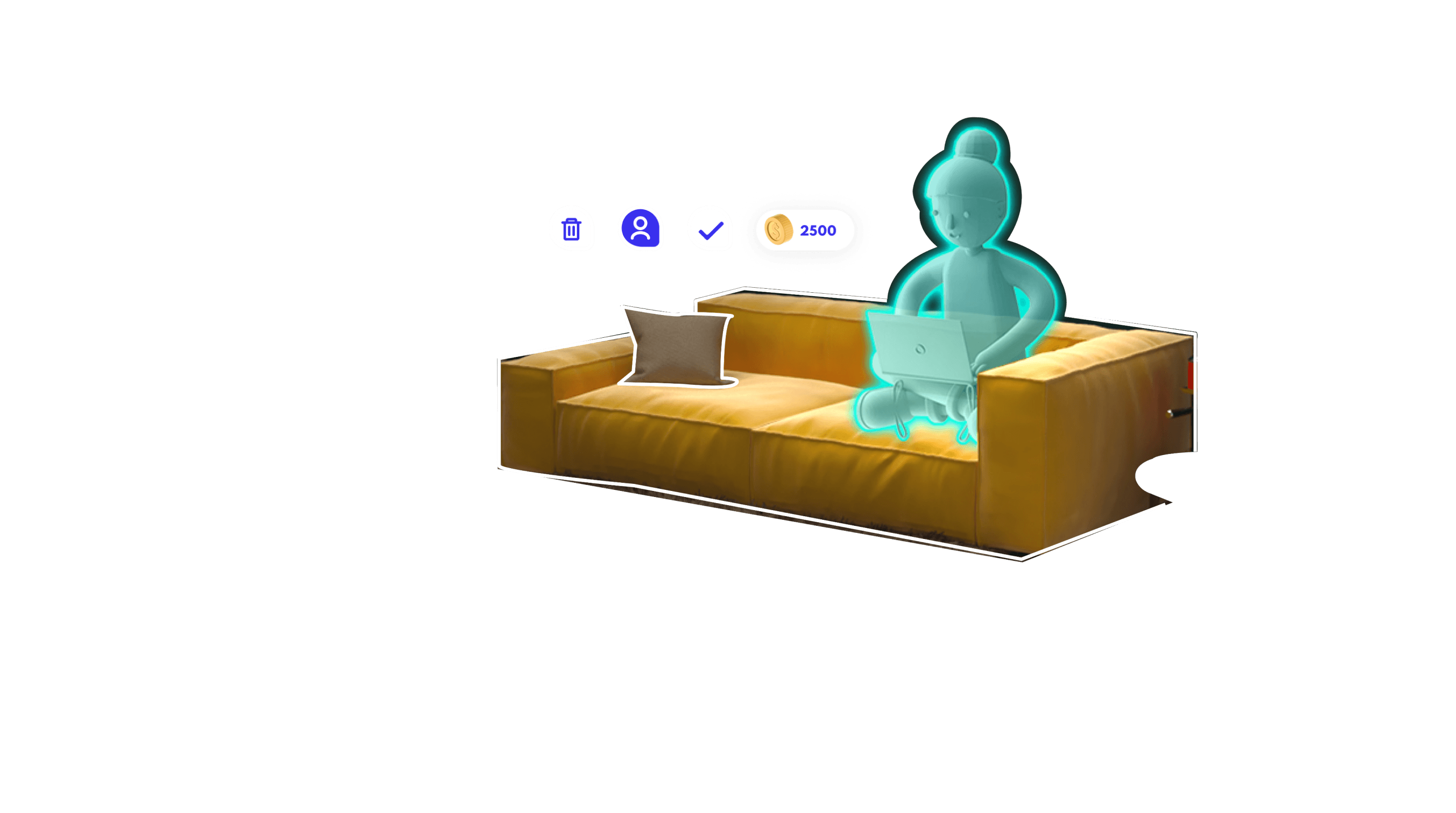
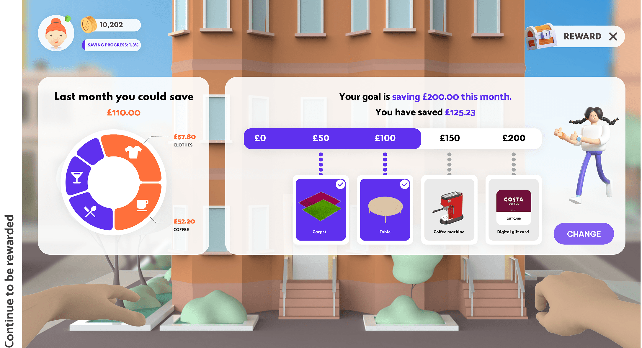
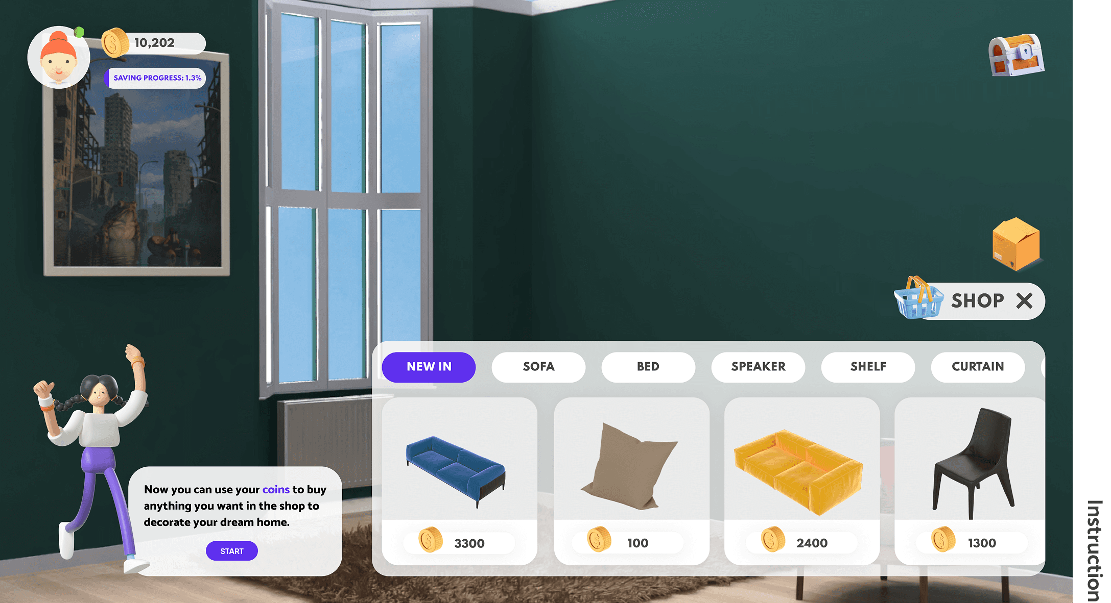
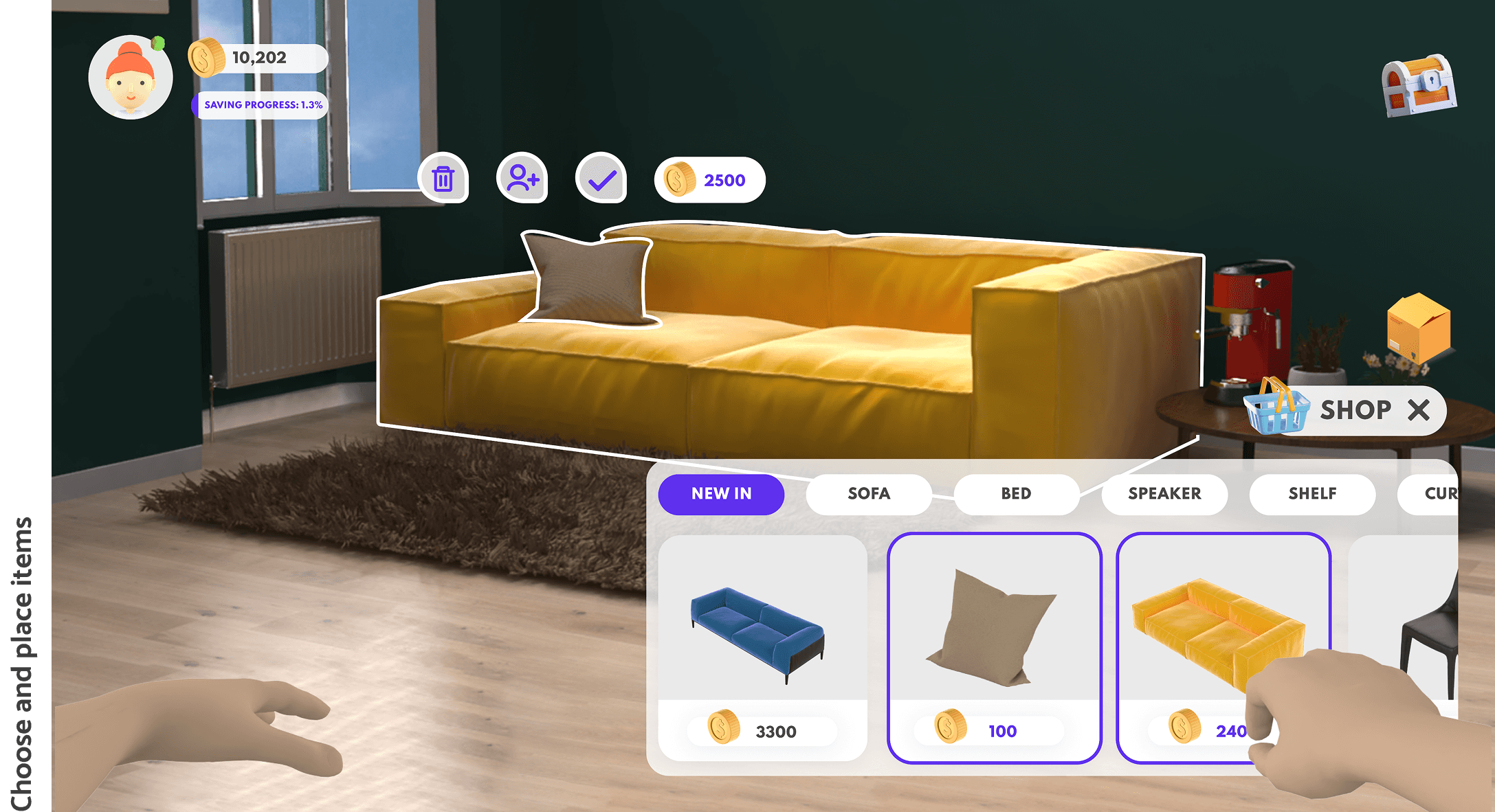
Concept Interface.
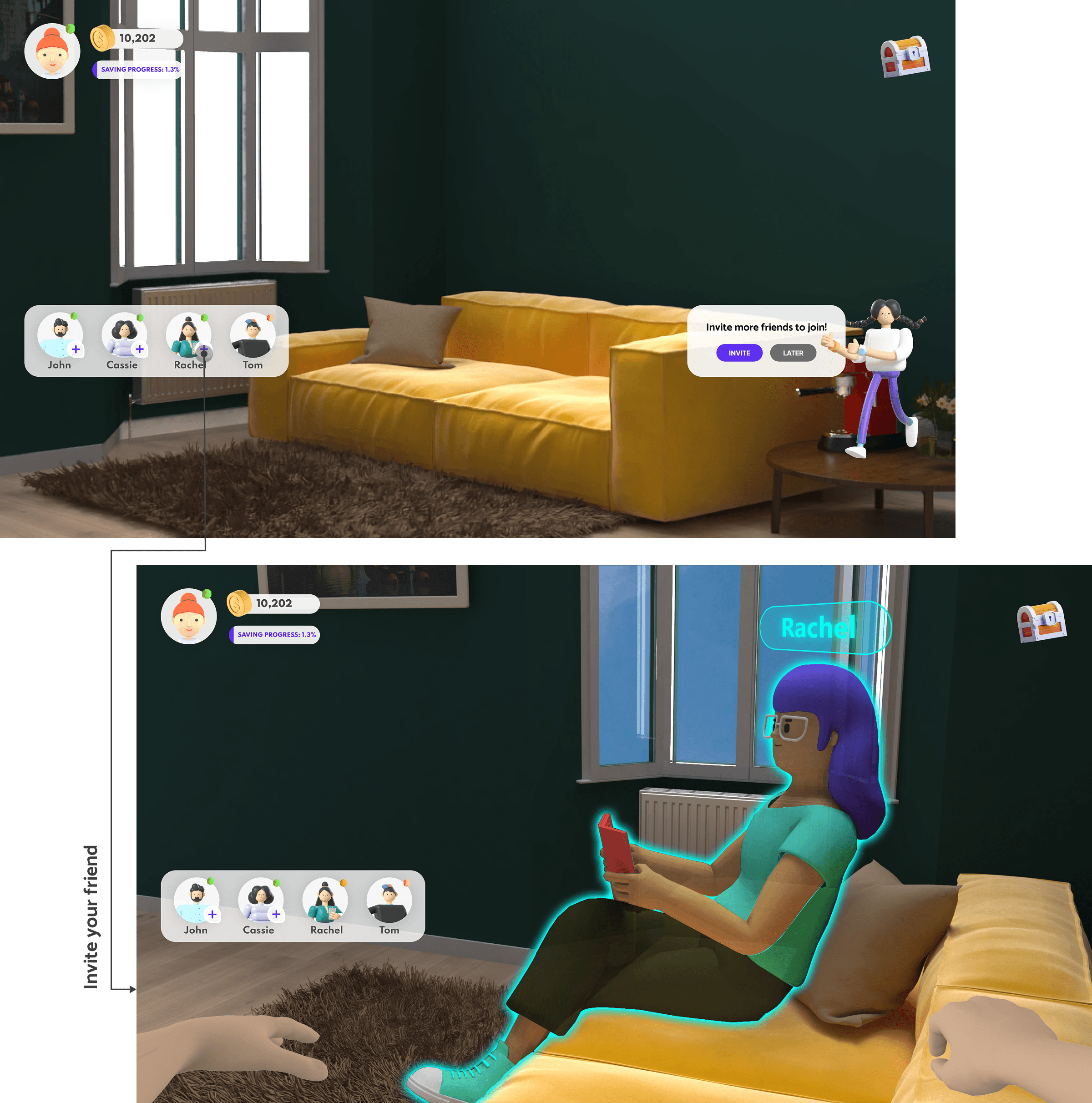
The interfaces of Metaville display more detail about the concept and the features. It combines 2D interface and 3D modelling.
Onboarding Process
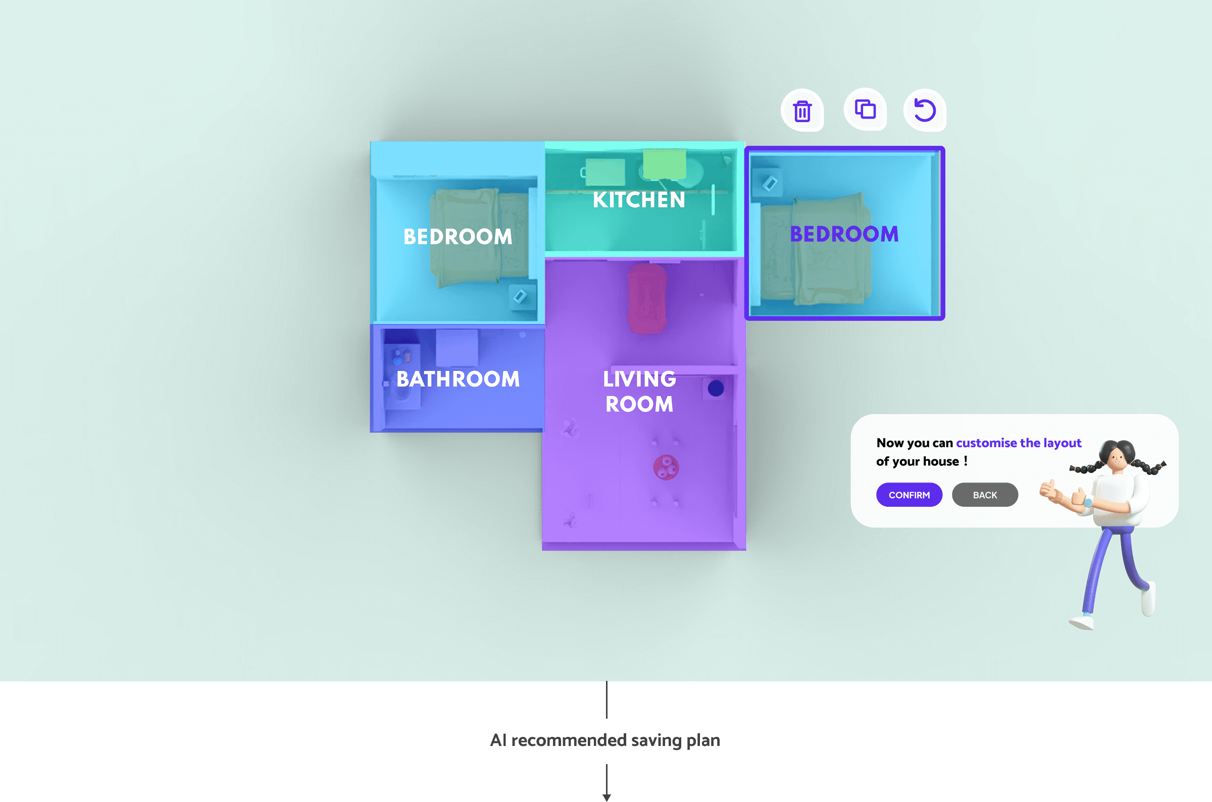
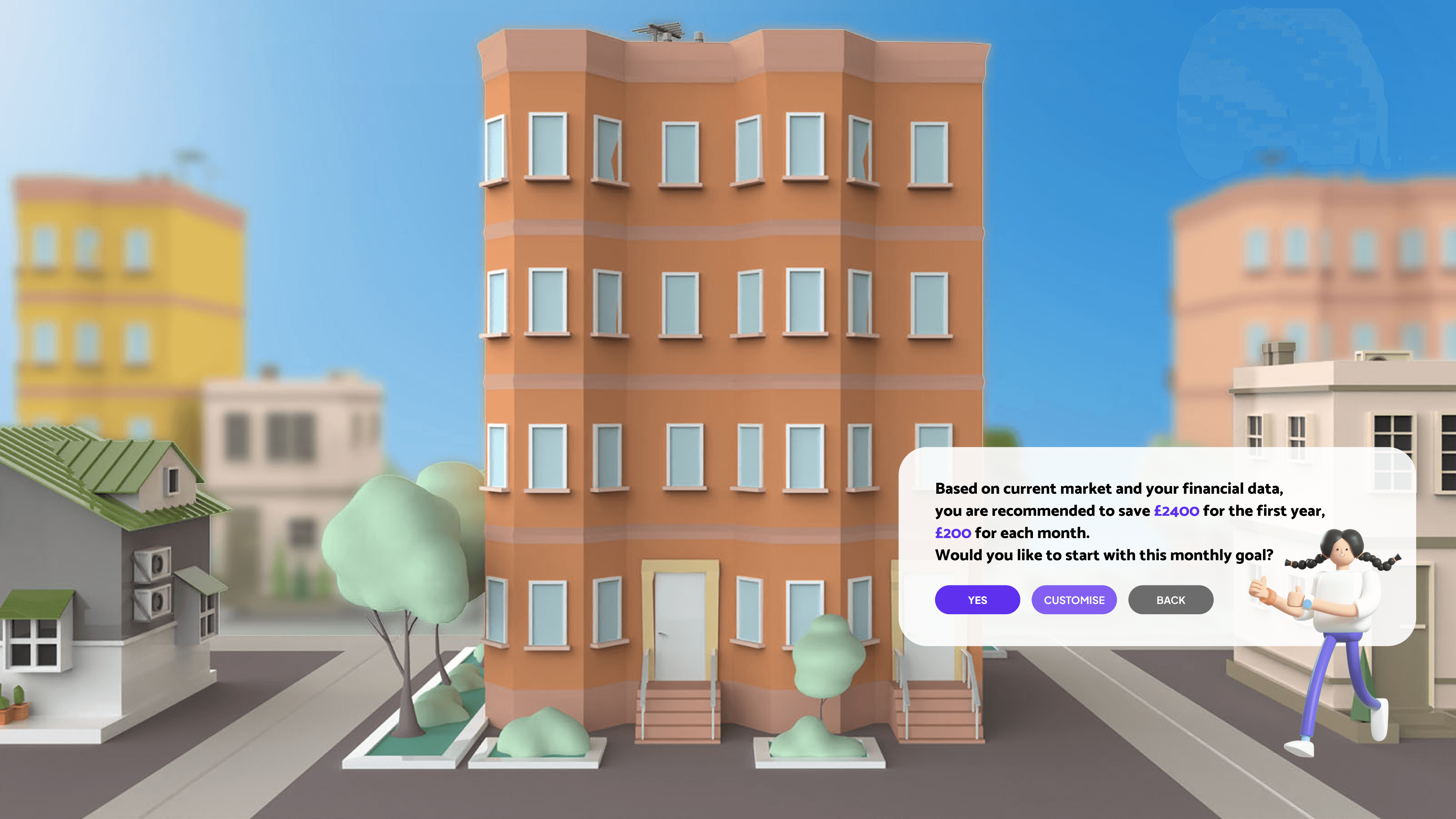
AI Recommendation
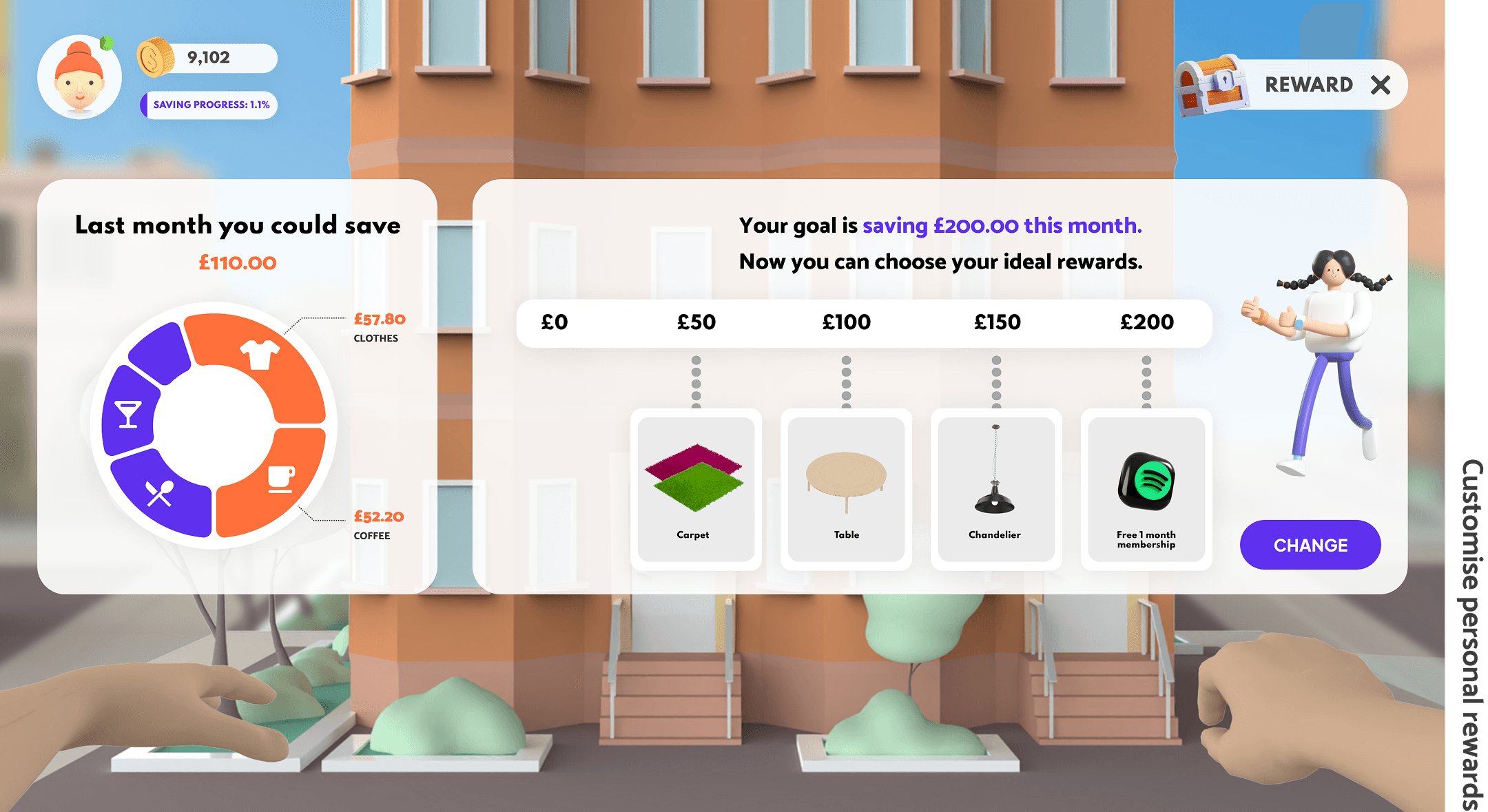
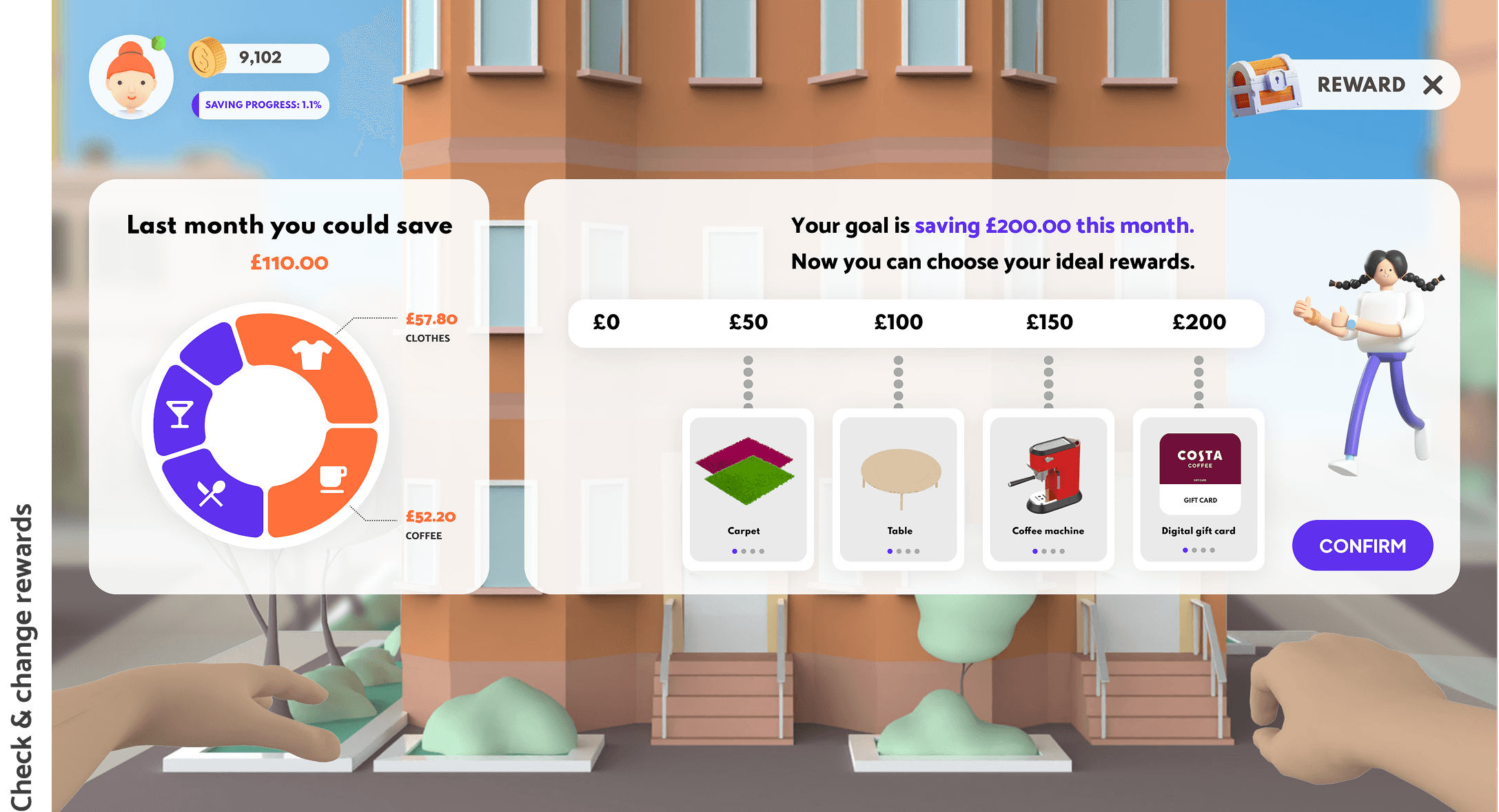
Personal AI Assistant & Reward Behaviour
Purchase Items & Home Decoration
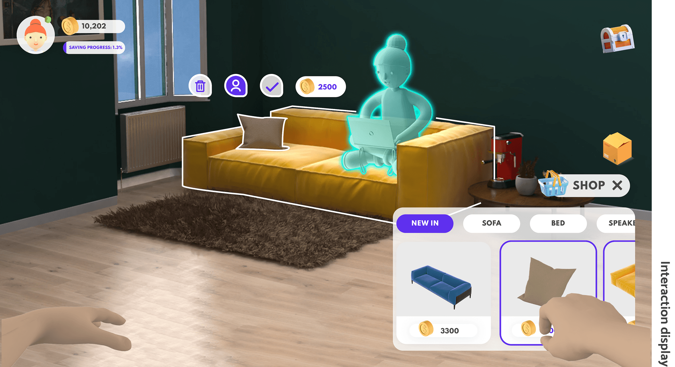
Social Experience with Friends
Future Development.
Metaville is a saving platform with social feature. Therefore, security is on the top list of our key value. During concept evaluation, we identified potential risks that could arise such as bullying and anti-social behaviour, we would increase data protection and controls. The increased engagement of users can also mean that some users might be left out. Thus accessibility and inclusivity are very important parts of our value. We will also sustain our customers by keeping up with relevant trends and improving our products through feedback to enhance their experience.
The future development of Metaville will base on the key value of security, accessibility and inclusivity, and engagement. Due to time limitation, the group did not develop some idea into details to put the scope of the project under control. These ideas will be thought through in the following development.
#1
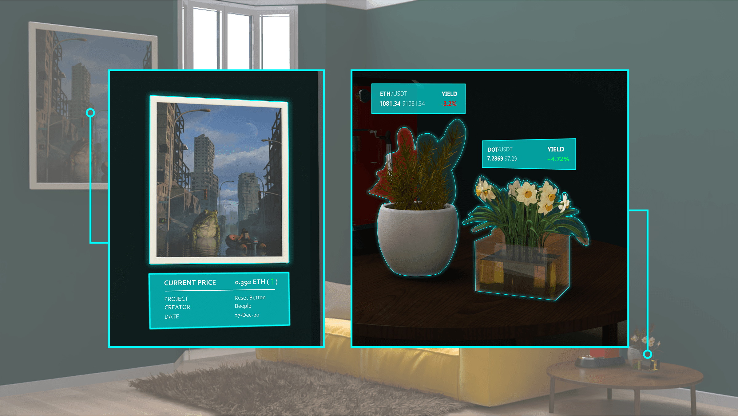
NFTs & Crypto Based Investments
The NFTs are represented by artworks and cryptocurrencies are in the form of different plants. The health state of the plants represents the yield of users' investment. All of these can be traded in Metaville. At the same time, users will receive investment advice and risk information.
#2
Enhanced Social Experience
Retaining our customers and keeping them engaged is beneficial for our service. The social spaces will be expanded to deliver new experiences in Metaville such as being able to watch a movie together and to attend a group conference. The safety and positive experience of all our users is a priority, and as we expand our social spaces implementing rigorous data protection measures against bullying and any form of anti-social behaviour is paramount.
Inclusivity & Accessibility
We recognised that other groups lie within our target users who want to achieve their saving goals but have different needs. Providing a shared account is beneficial for people like Katy who want to jointly save with their partner to achieve a common goal without the challenges that may arise. Metaville will be able to help with providing personalised saving goals, keeping track of finances effortlessly and enhancing the bonds between partners through shared positive experiences.
#3
Our service also aims to provide value to differently-abled people like Josh who wants to not only meet his saving goals towards a home but have added saving requirements to adapt the home to his needs. Metaville will provide customised saving goals based on users' personal circumstances and we will ensure a broad range of our users can interact with our product by being compatible with assistive technology and interaction gears. Usability is integral to our users' experience so we will make sure we adhere to WCAG guidelines, for example, people with motor disabilities or visual impairments who might use a joystick for navigation purposes should know which elements they are focusing on and will require our interfaces to be consistent and logical.

Other Saving Goals
For users who want to save for other long-term goals such as buying the dream car, saving for a wedding or planning towards a holiday. We will develop Metaville by creating an equally visually engaging experience related to other saving goals. This will add further value towards customer engagement with our service and broaden the scope for expanding our stakeholders.
#4
Reflection.
Our team finished the project without an actual leader. We took turns arranging the agenda and being the spokesmen in front of the clients. Thus everyone could be more engaged in the teamwork and had their voice. But working in a leaderless group also has problems. In previous experience, I used to identify myself as an action-oriented role in group work. I was more comfortable with clear tasks instead of ambiguity. Yet it could be challenging in a leaderless group when no one clarifies the goals and summarises the achievement in every meeting. And as our topic brief started with an opportunity instead of a pain point, the group had to decide a lot to find the project direction. The decision-making process slowed down the project a lot at the beginning. So I started to step out of my comfort zone to speak up and organise the meetings when encountering deadlock. I am also more open to different ways of collaborating now.
The journey of building Metaville enabled me to have a better understanding of Web3. It also gave me a chance to get a glimpse into the consultancy through the project. The project let me experience how to help traditional businesses like traditional banking explore the opportunity to be at the cutting edge of technology such as Metaverse and how to quickly start design in a relatively new field. During the project, we went through ups and downs, from rolling up our sleeves to navigating uncharted water, from excitement to self-doubt. Finally, we delivered a product which the clients are happy with and we are proud of. Trusting the process but not being restrained by the detailed steps of the process is what I learned. The design process led me to advance the project in the new field. Agile made the team more flexible when facing challenges from clients and time. It was a pleasure to be part of this process and this project.